

overview
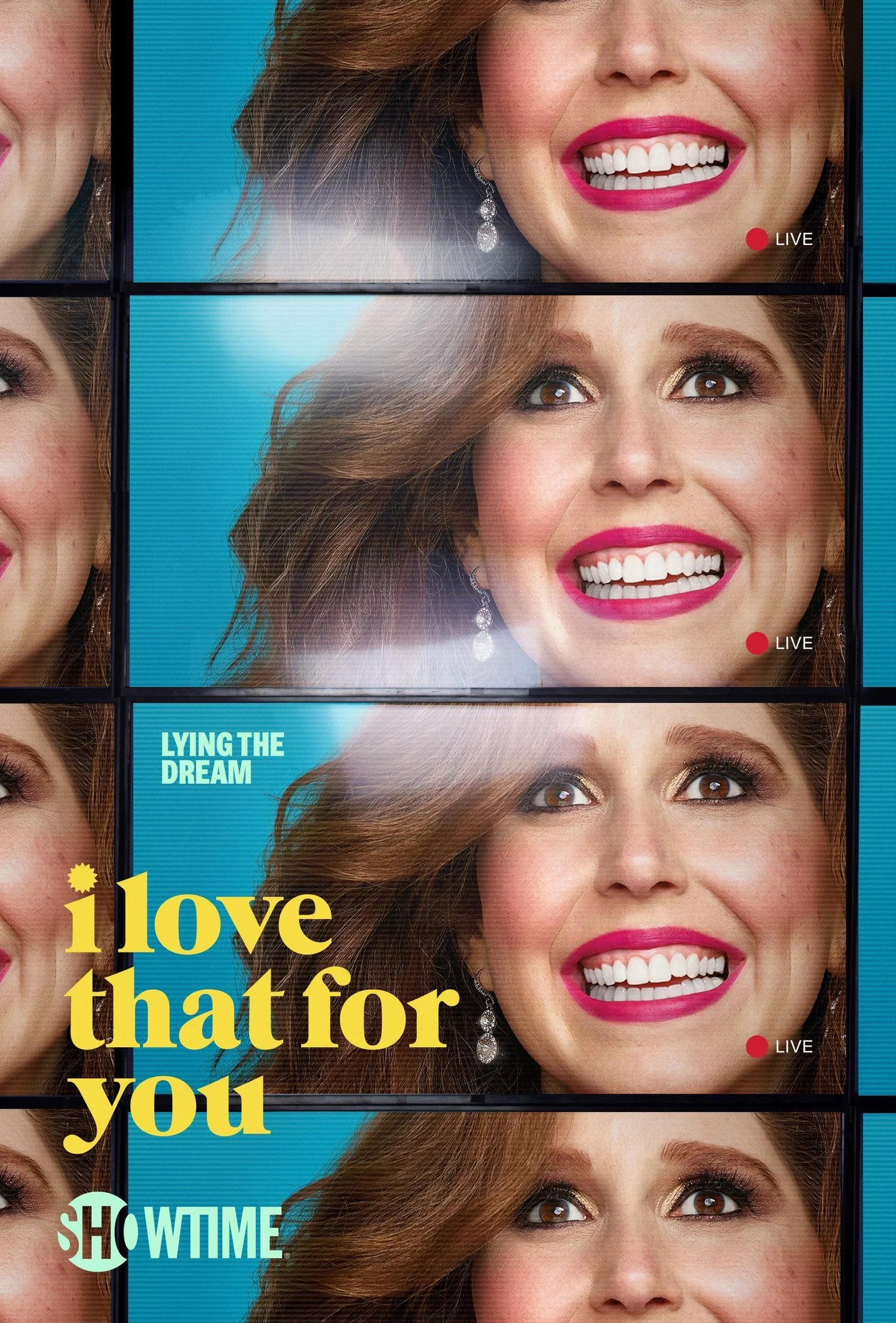
I Love That for You is a Showtime original comedy inspired by Vanessa Bayer’s personal journey overcoming childhood leukemia. The series follows Joanna Gold, who finally lands her dream job as a host on a home shopping channel — only to fabricate a lie about her illness returning in order to keep it.
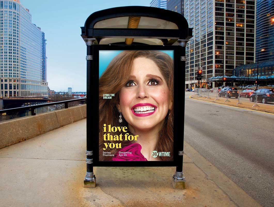
The campaign required a visual identity that balanced sincerity and satire, capturing the bright, glossy world of televised retail while grounding the work in the emotional awkwardness, vulnerability, and optimism that define the show. At its core, this is comfort TV about being uncomfortable — a comedy rooted in relatable anxiety and emotional truth.
Role & Responsibilities
Role: Art Director
Responsibilities:
Developed the key art concept and overall visual direction
Directed sketches, created mood boards, and developed mockups for executive presentations
Pitched photographer Jill Greenberg to execute the campaign shoot
Designed final artwork and provided detailed retouching guidance
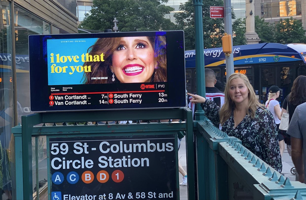
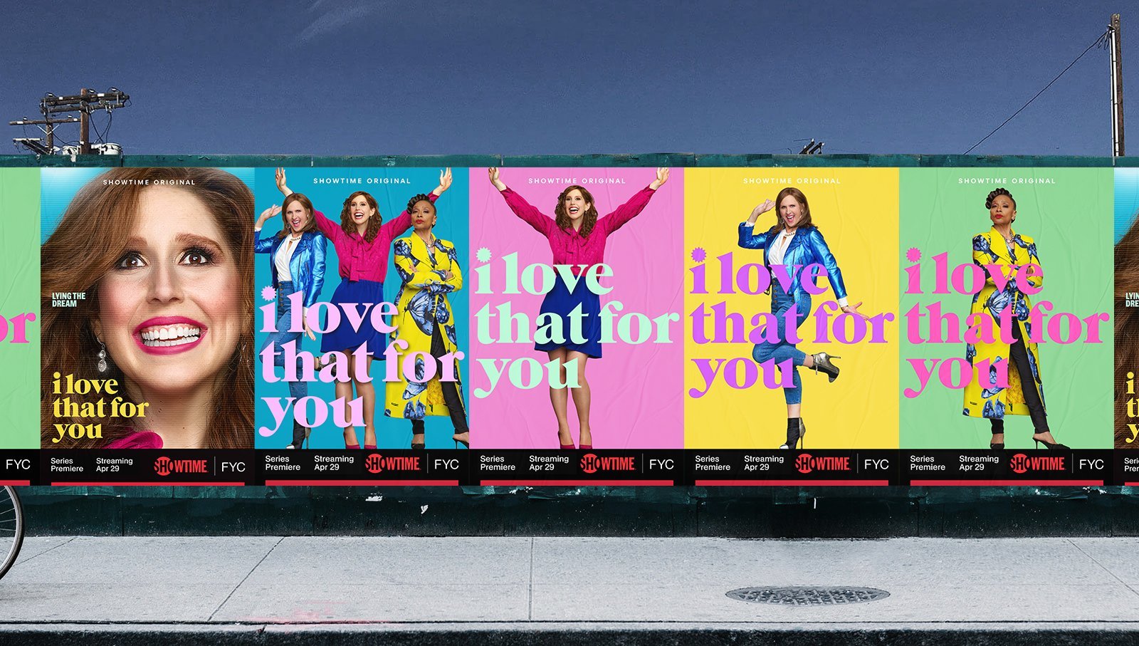
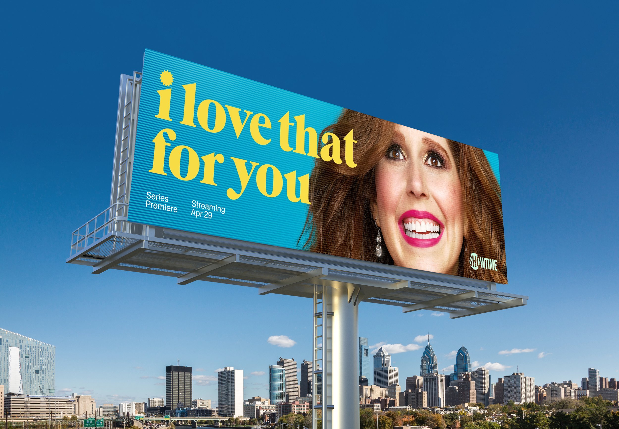
Produced out-of-home materials and developed a comprehensive style guide to ensure consistency across platforms
Campaign Concept
The visual strategy centered on reflecting the show’s unique tonal balance — heartfelt ambition paired with comedic absurdity. Bright, saturated color palettes and bold typography echoed the heightened optimism of home shopping television, while composition and expression emphasized Joanna’s earnestness and vulnerability.
The imagery was designed to feel welcoming, playful, and slightly off-kilter — allowing humor to coexist with genuine emotional stakes.
Process & Development
Working closely with creative teams, I helped conceptualize the photoshoot with a focus on character, tone, and performance. Captured imagery was then distilled into simple, confident key art that let character and color do the heavy lifting.
The visual language was extended across digital, print, and out-of-home placements, supported by a comprehensive style guide that ensured cohesion across all campaign executions.
Final Deliverables
- Key Art - Digital and Print Assets - Out-of-Home - Style Guide
Reflection
This project was an exercise in tonal precision — finding the sweet spot between humor and heart. By leaning into simplicity, color, and character, the campaign reflected the show’s warmth and awkward charm while maintaining clarity and impact across all platforms.
Credits
Photographer: Jill Greenberg
Creative Directors: Bob Motzenbecker, David Krtikashyan
Logo Designer: Scott Massey