Overview
The L Word: Generation Q reimagines the groundbreaking original series through a contemporary lens. The campaign required a visual identity that honored the legacy of the franchise while introducing a fresh, authentic point of view for a new generation.
The creative needed to feel modern, inclusive, and emotionally grounded — acknowledging the show’s cultural significance without relying on nostalgia or overt symbolism.
Role & Responsibilities
Role: Lead Art Director
Responsibilities:
Led key art concept development, including sketches, mood boards, and mockups for stakeholder presentations
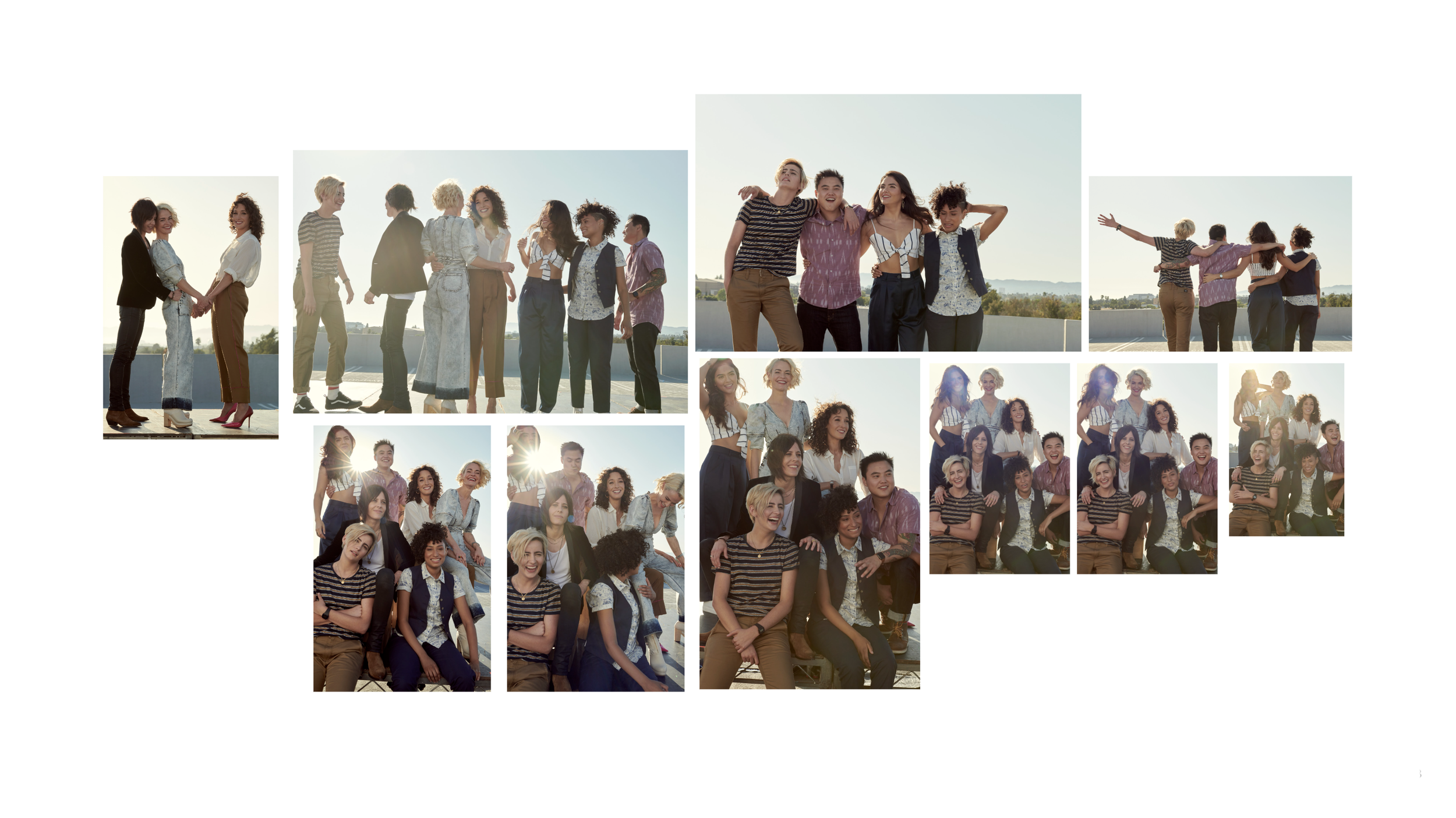
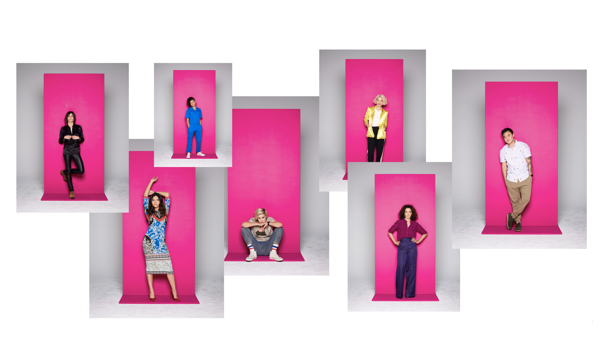
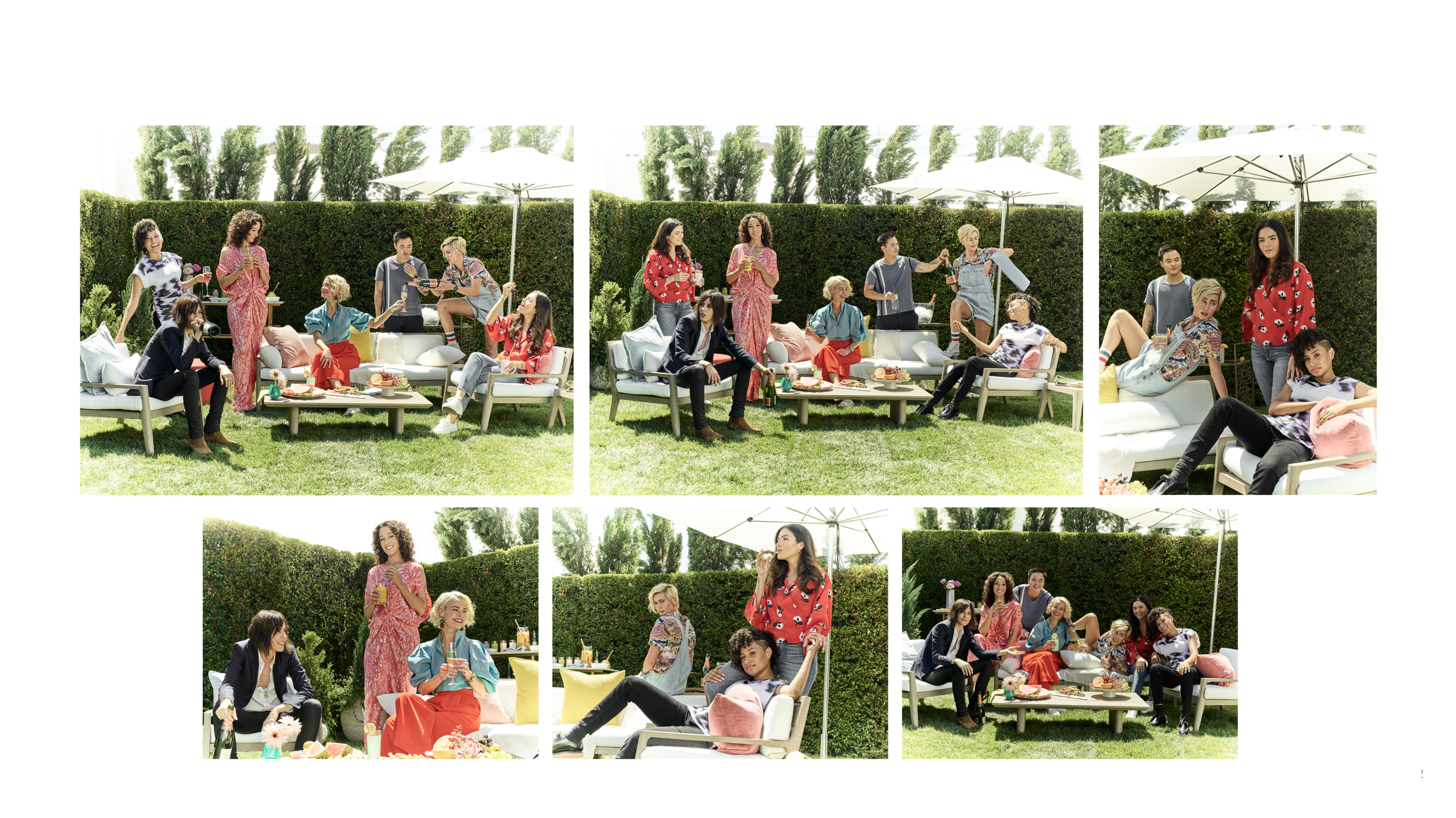
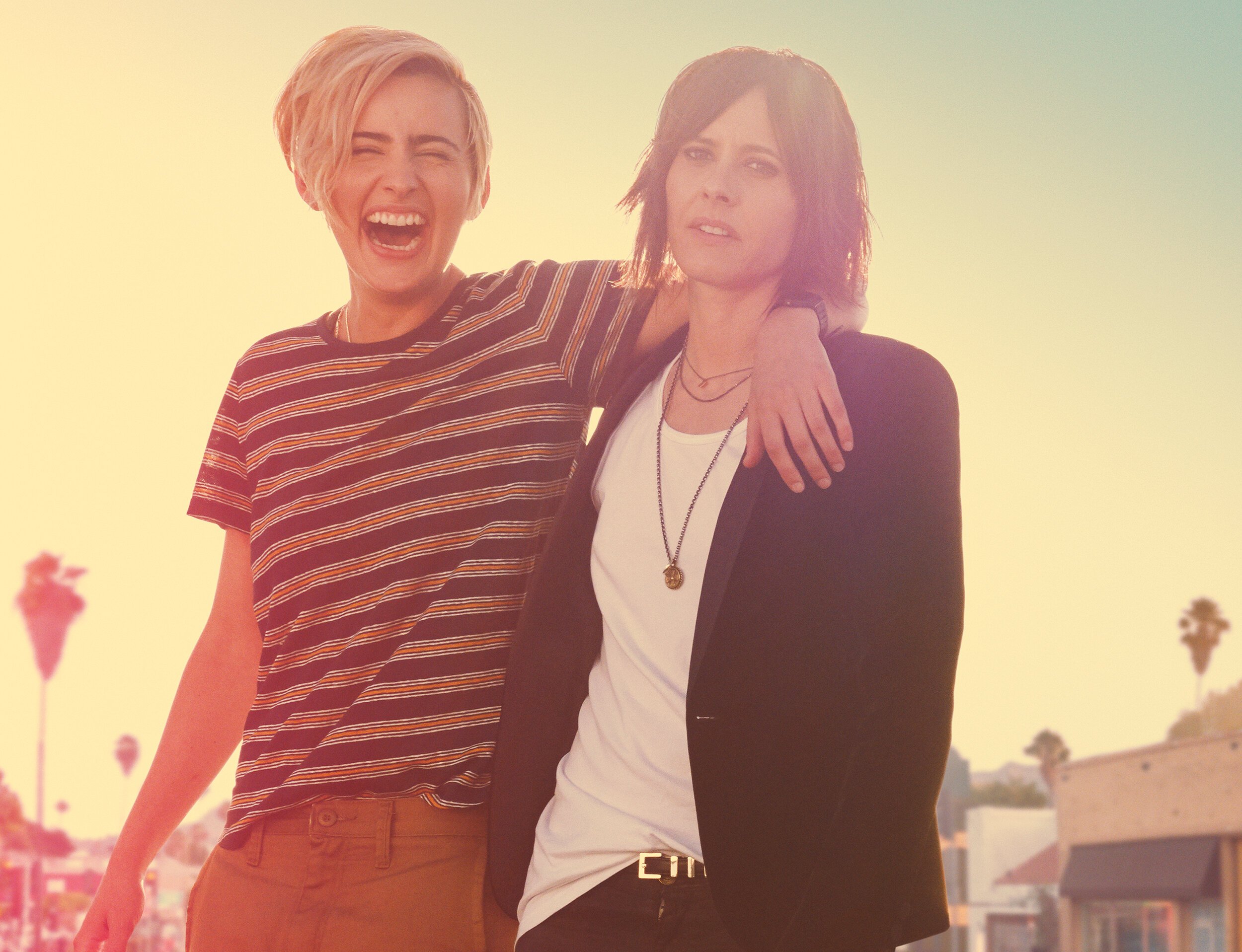
Selected photographer Cass Bird and oversaw in-person shoot planning and execution
Designed final artwork, handled compositing, and collaborated on finishing
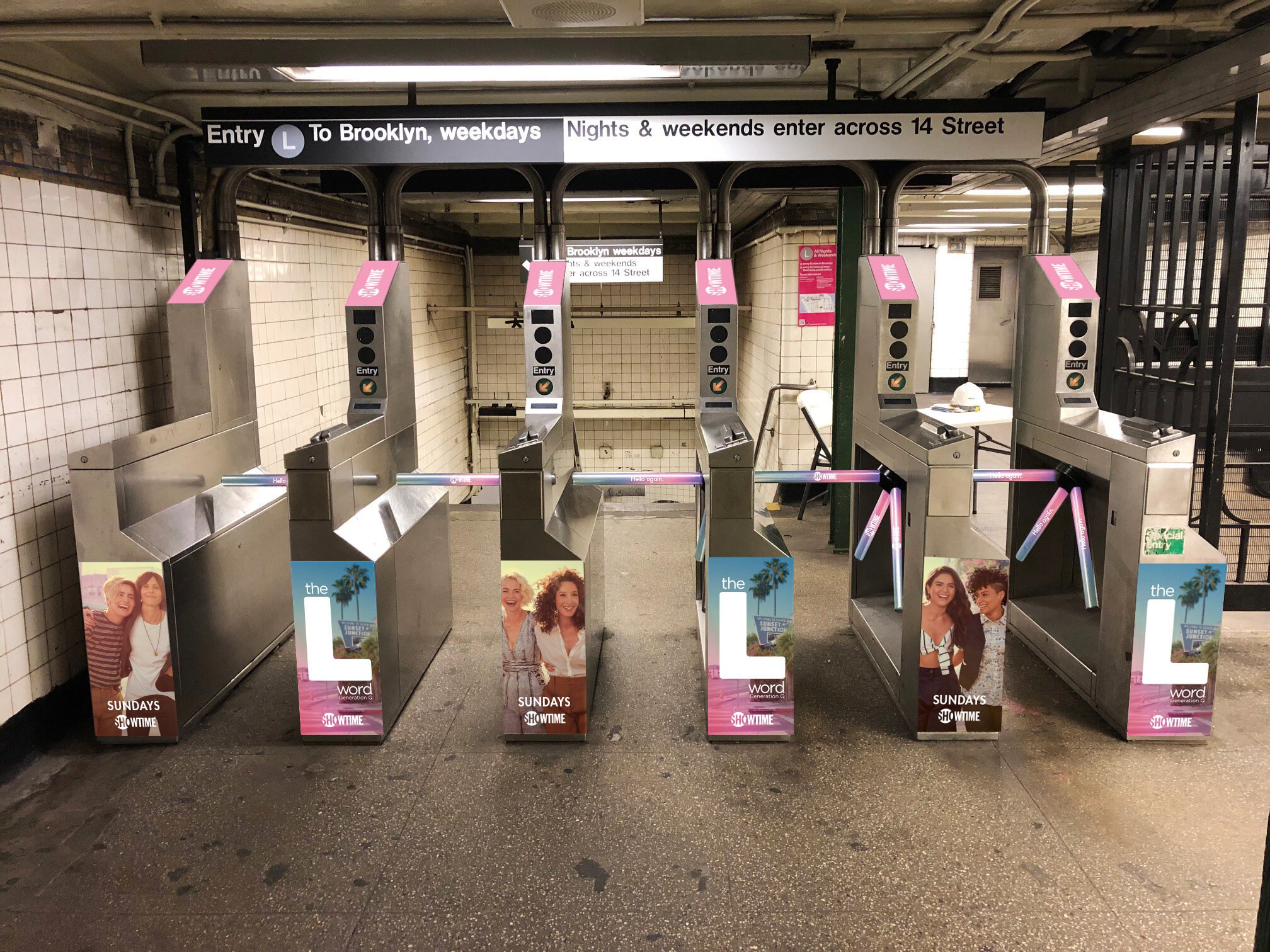
Executed out-of-home and digital assets
Developed a comprehensive style guide to ensure consistency across platforms
Campaign Concept
The creative direction embraced a naturalistic aesthetic, intentionally moving away from the bold color language of the original series.
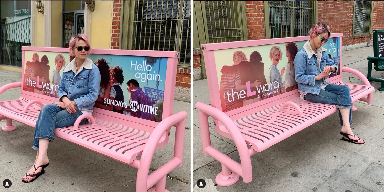
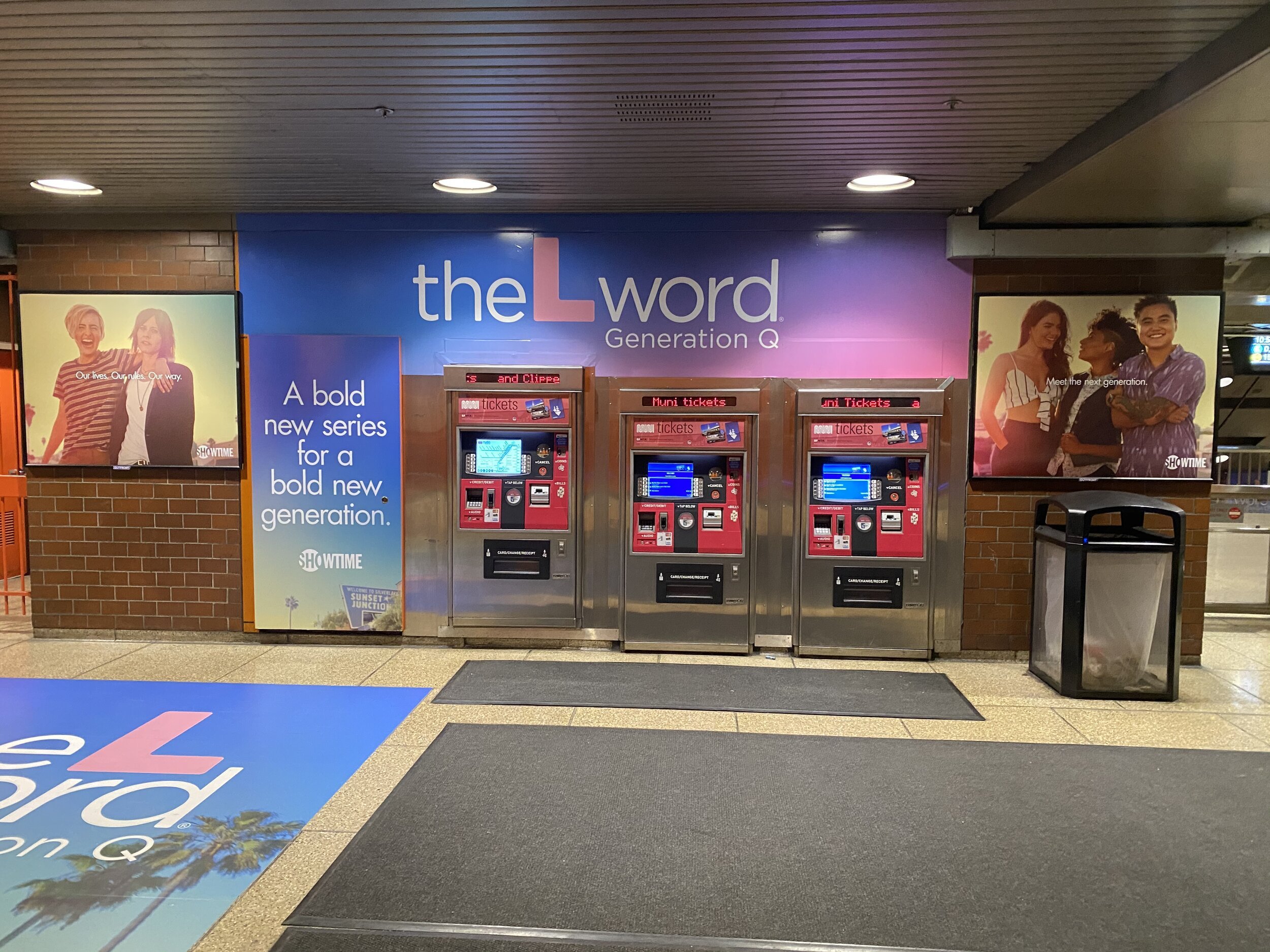
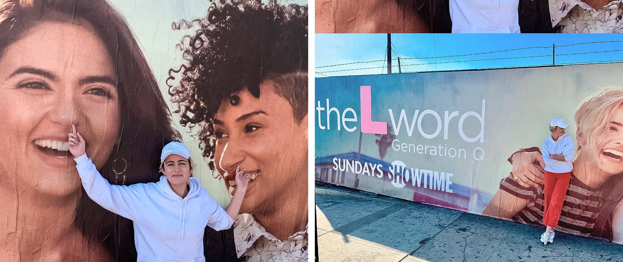
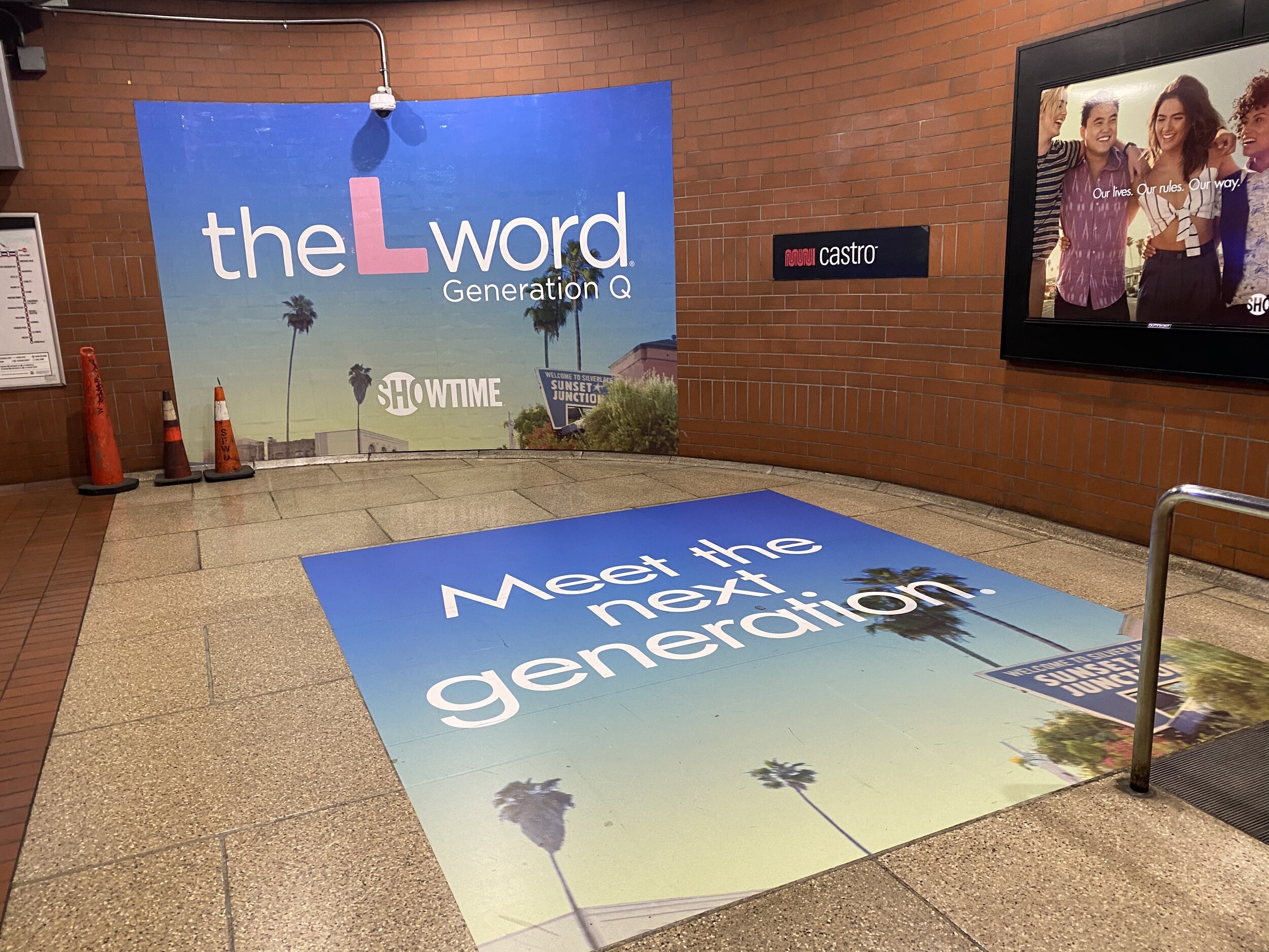
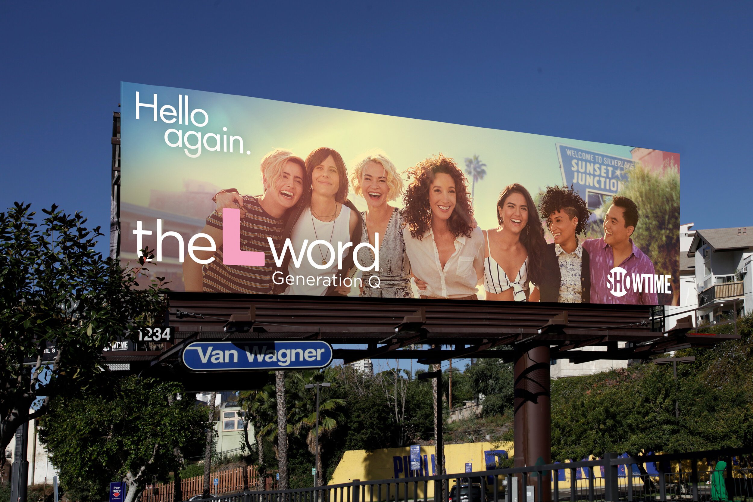
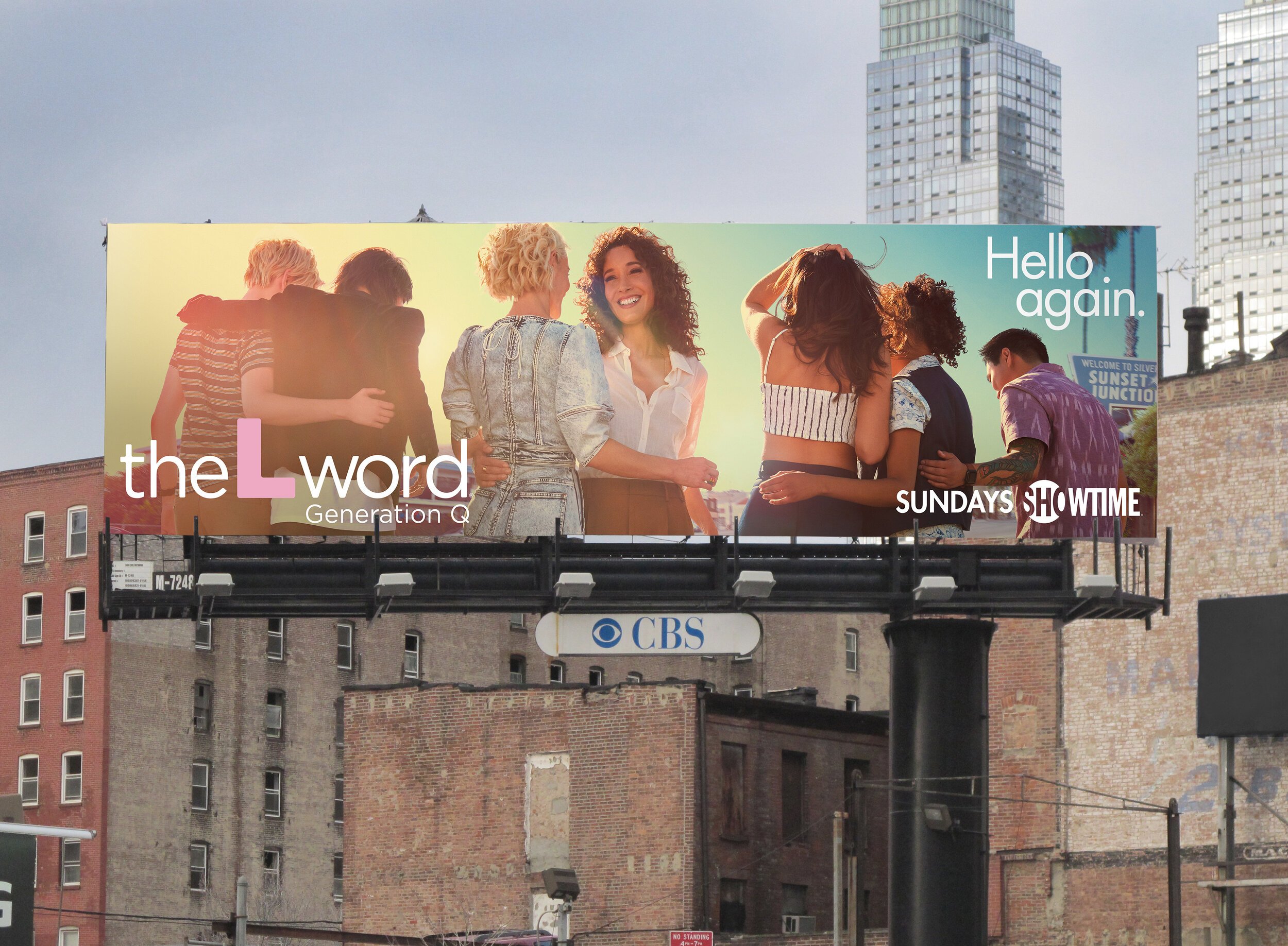
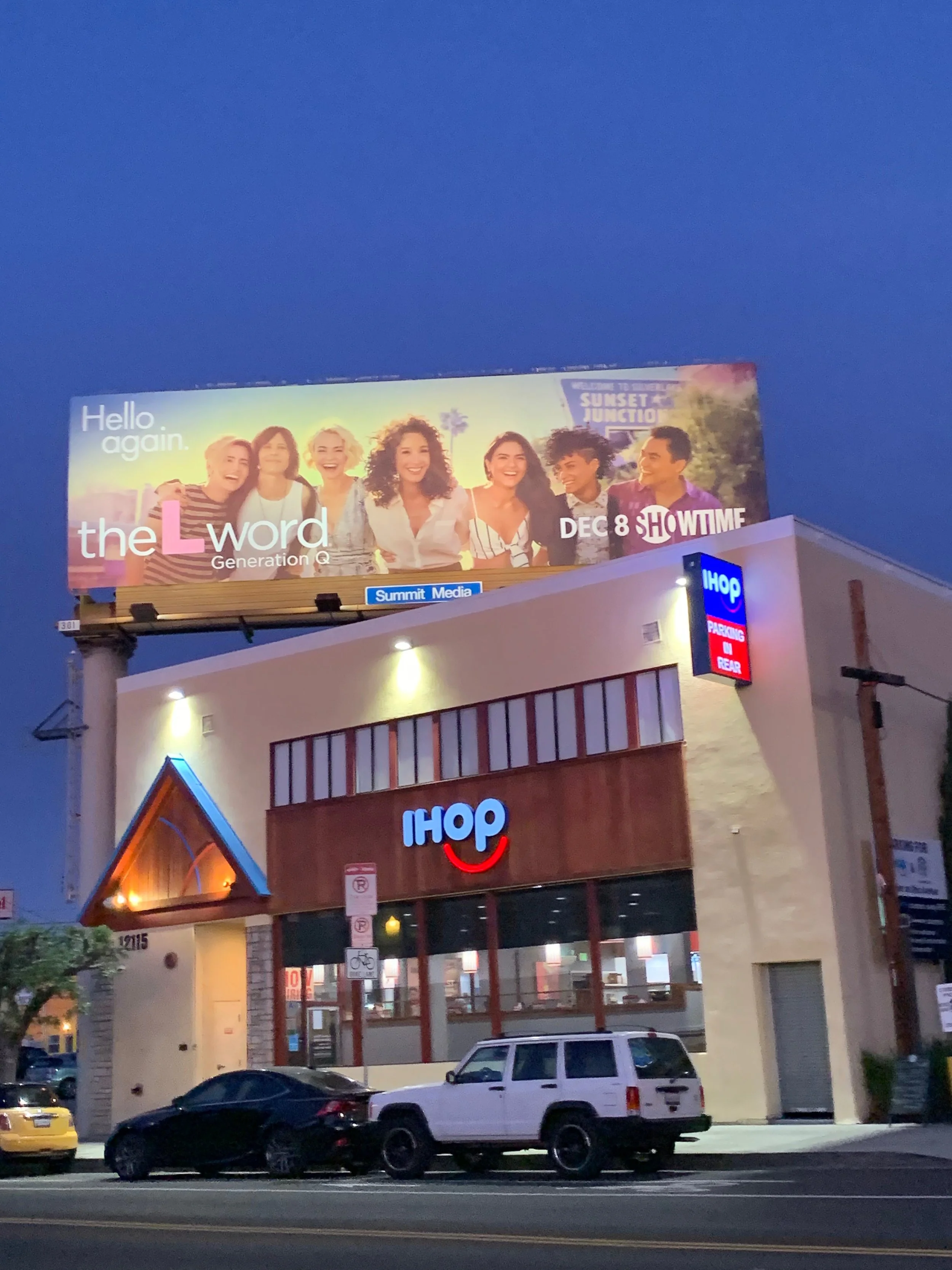
Season One artwork utilized a cool, sun-washed summer palette — forming a subtle, deconstructed rainbow that nodded to queer identity without explicit iconography. The approach centered authenticity, intimacy, and community, allowing representation to feel lived-in rather than performative.


Process & Development
Working closely with Cass Bird, we focused on capturing imagery that felt honest, observational, and emotionally resonant. Early mood boards and mockups aligned creative direction with stakeholder expectations, while careful compositing and finishing ensured cohesion across the campaign.
The visual system was designed to scale across key art, OOH, digital, and PR placements while maintaining the same quiet confidence and tonal consistency.
Final Deliverables
- Key Art - Out-of-Home (OOH) Materials - Digital Assets - PR Assets - Style Guide
Recognition
The campaign was featured prominently across major markets, including billboards in Los Angeles, San Francisco, and New York — successfully reintroducing the series to longtime fans while welcoming new audiences.

reflection
This project demonstrated the power of restraint and intention in reintroducing a culturally significant series. By prioritizing authenticity over spectacle, the campaign bridged legacy and modernity, resonating with a diverse, contemporary audience.

credits
Advertising Photographer: Cass Bird
PR Photohrapher: Kharen Hill
Creative Director: Bob Motzenbecker