
creative for story-led brands

Role: Art Director
brief
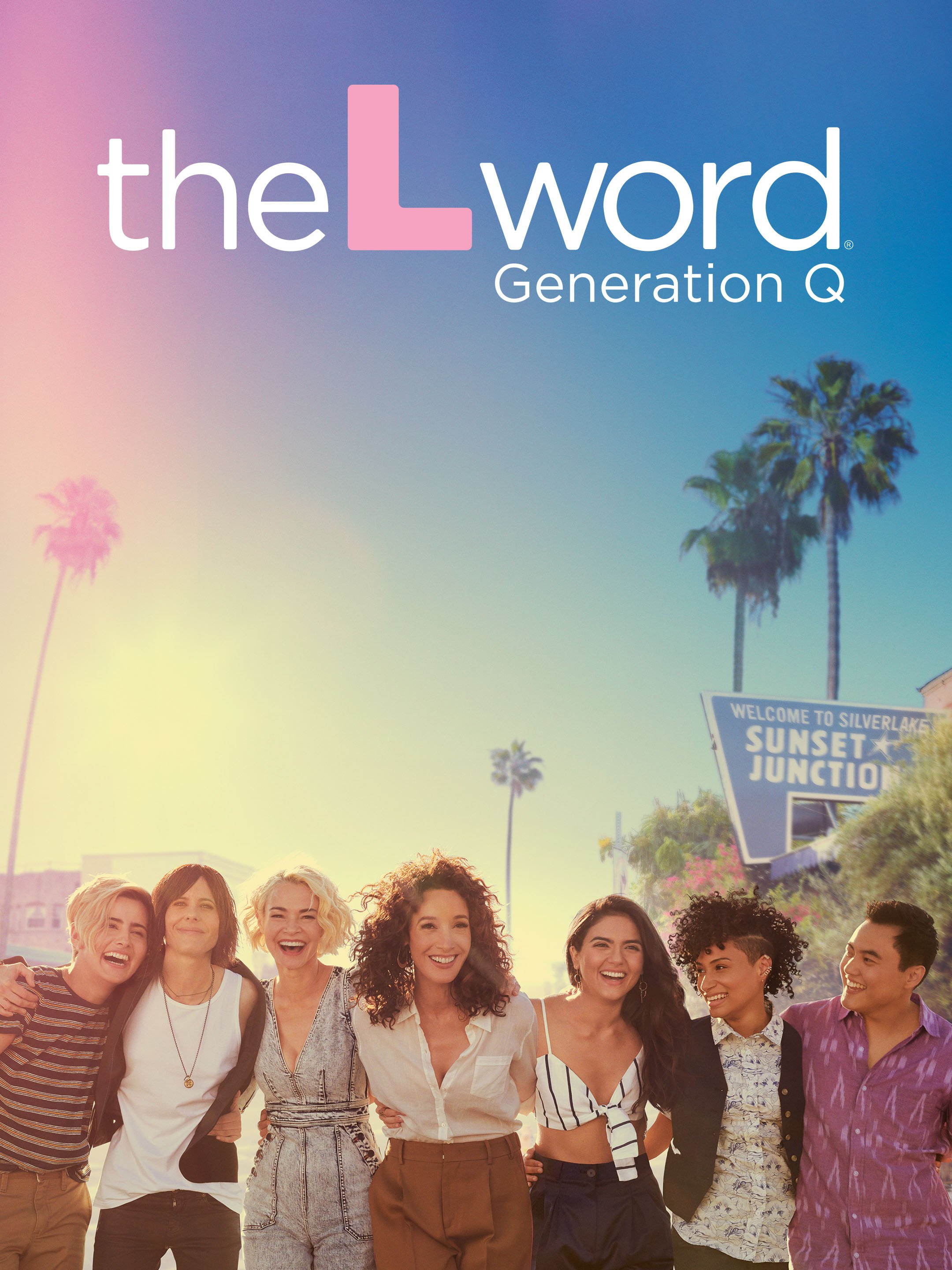
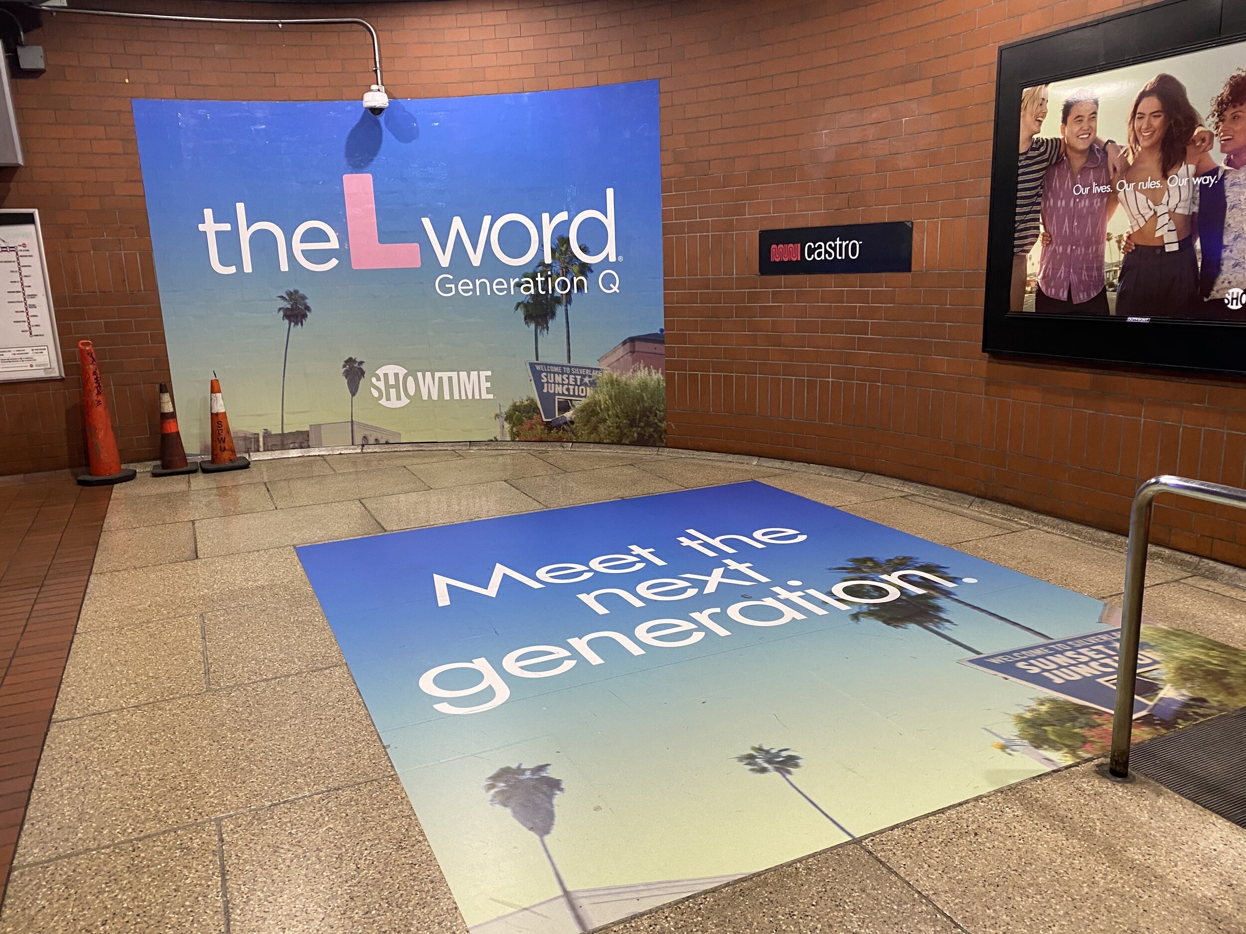
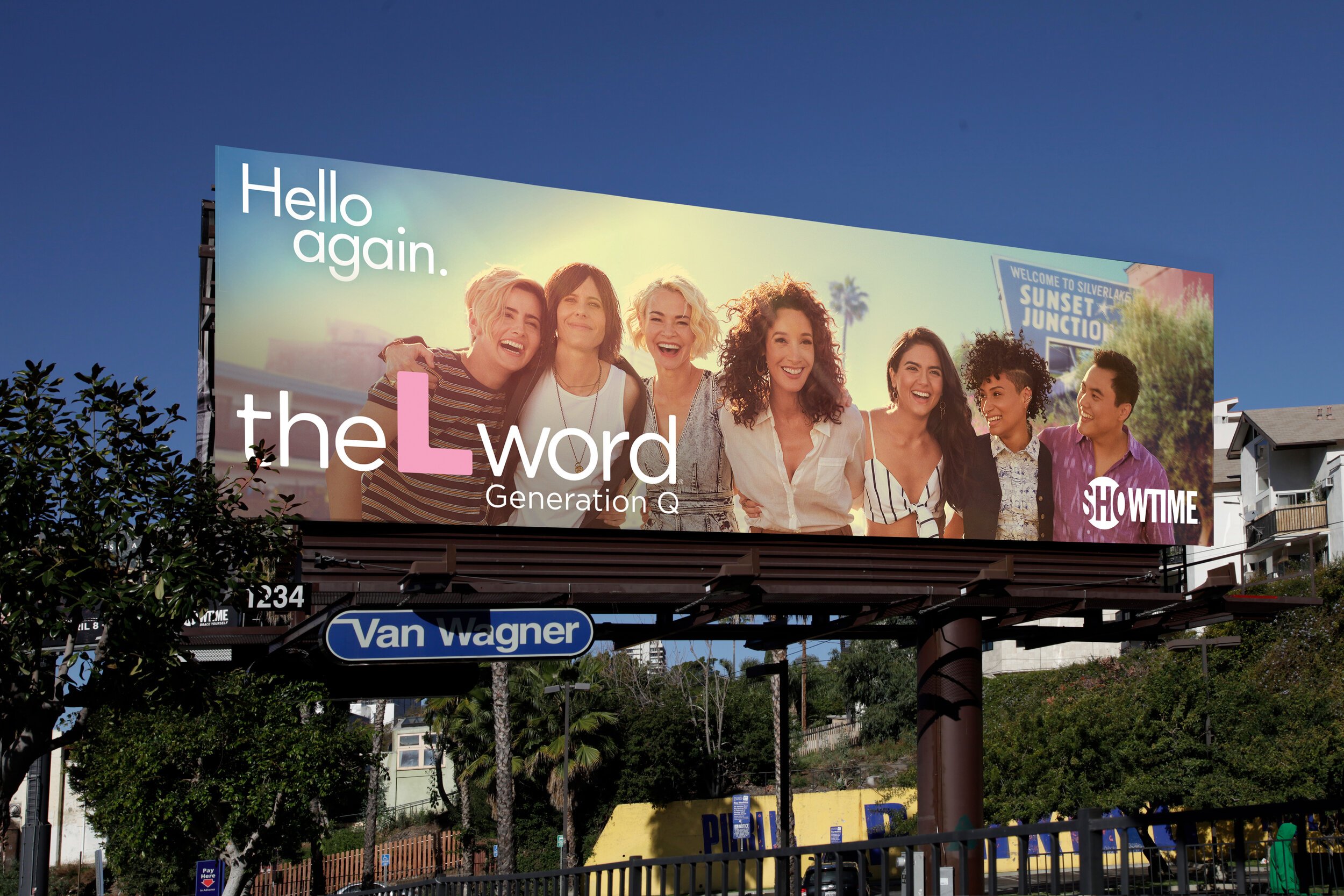
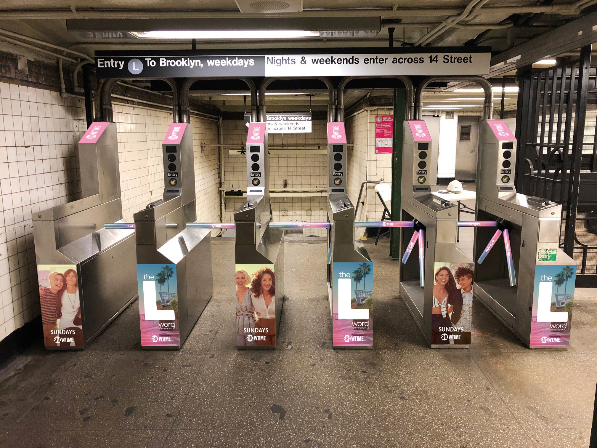
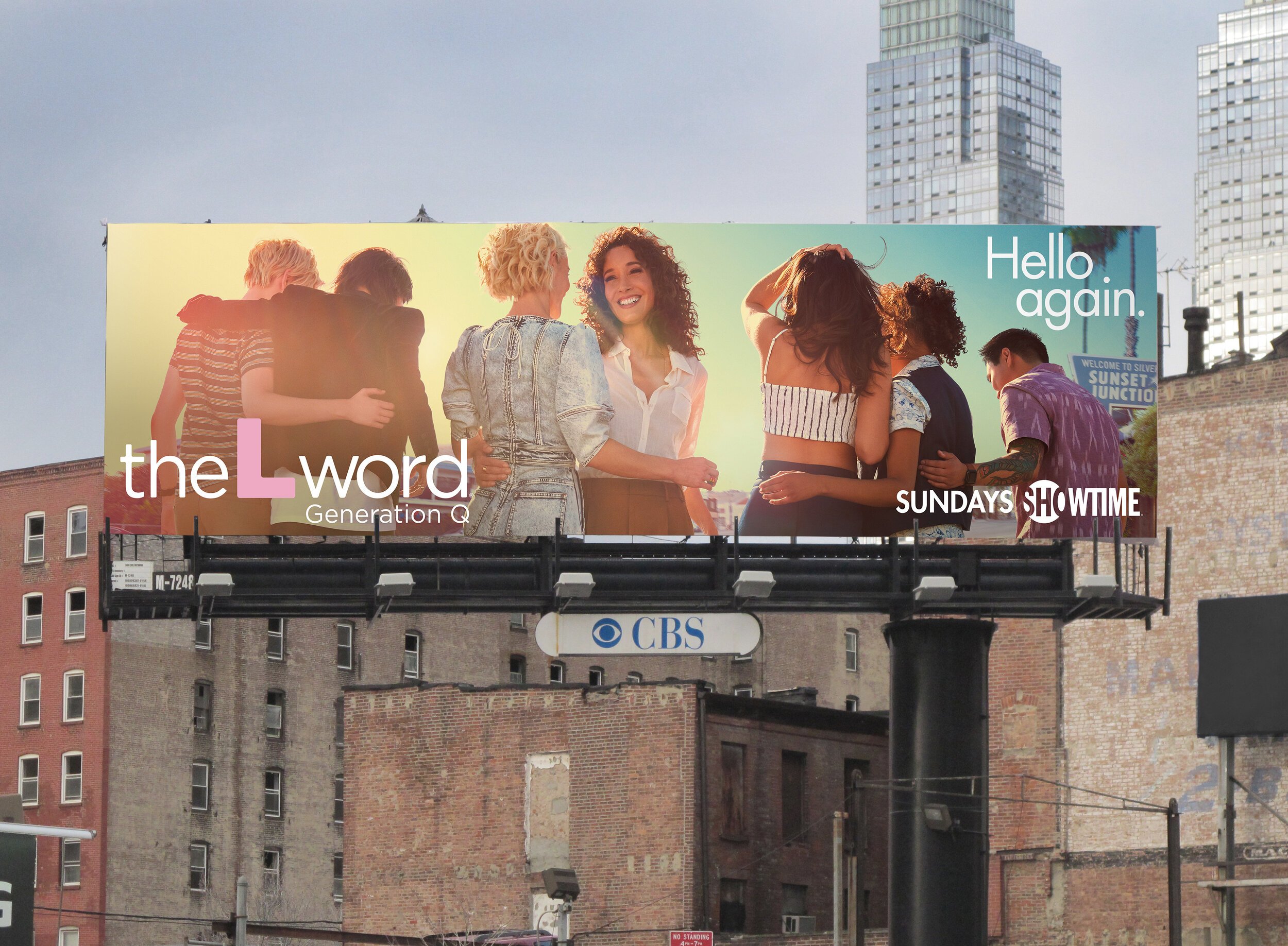
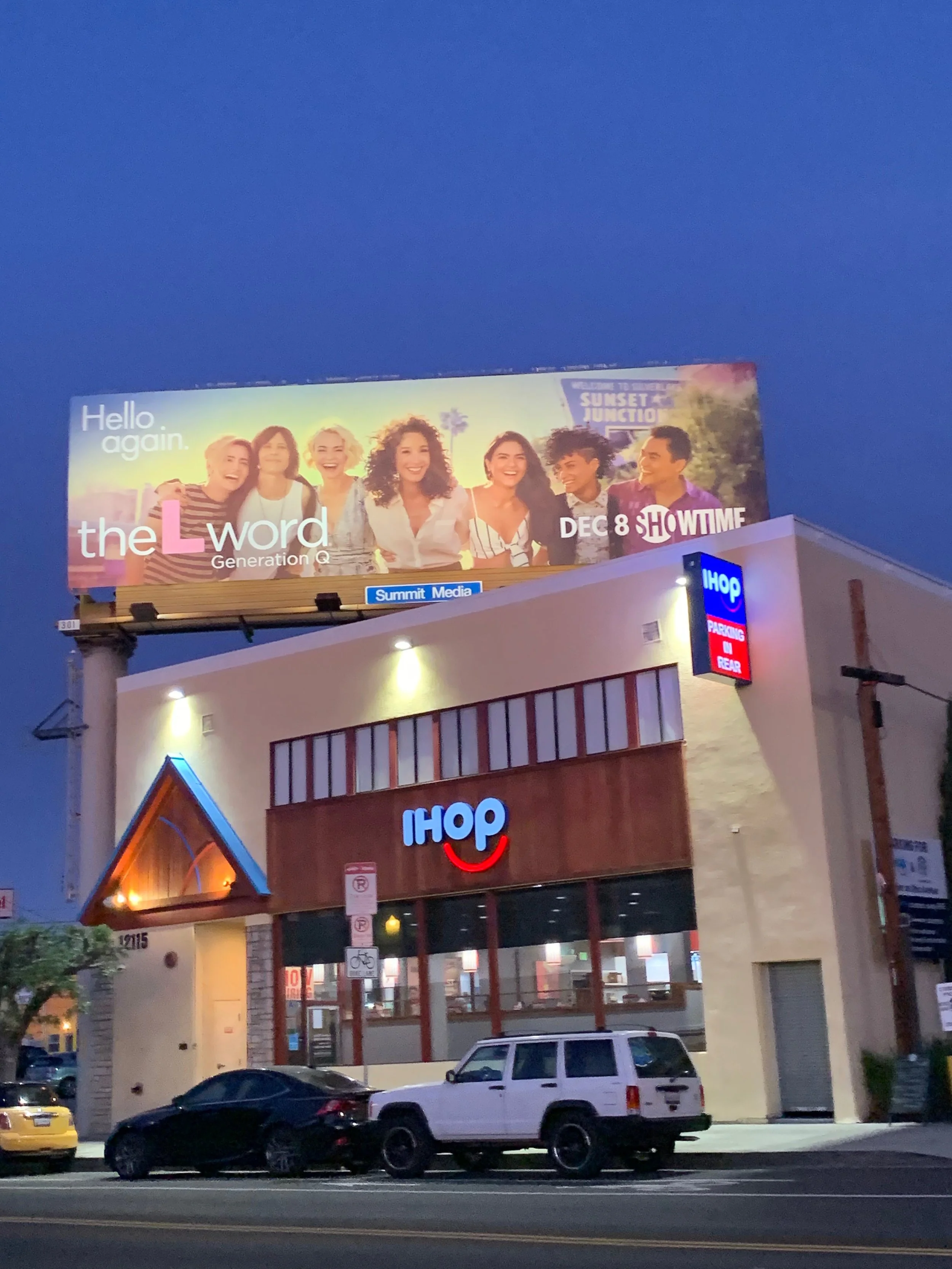
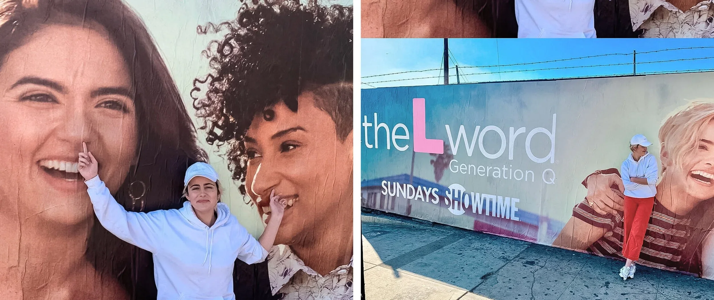
The L Word: Generation Q reintroduced a groundbreaking series for a new generation. The challenge was to honor the legacy of the original show while establishing a fresh point of view. One that felt contemporary, authentic, and emotionally resonant without relying on nostalgia or overt PRIDE symbolism.
honest, observational + emotionally grounded.
solution
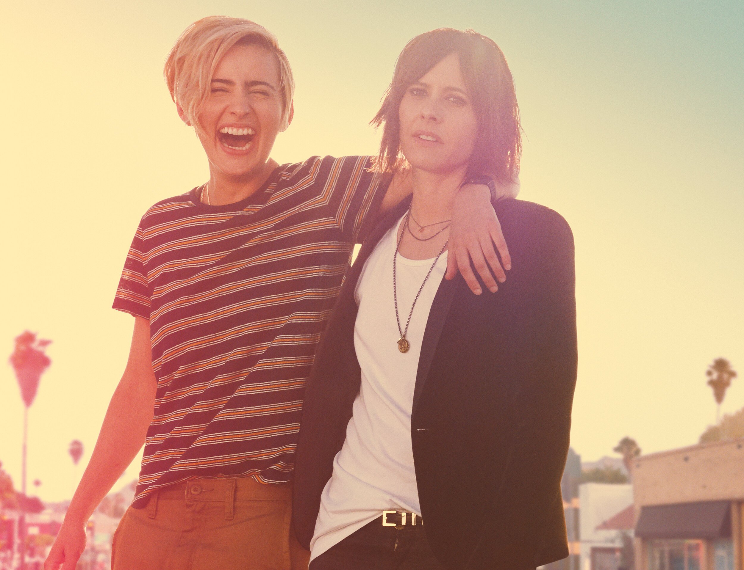
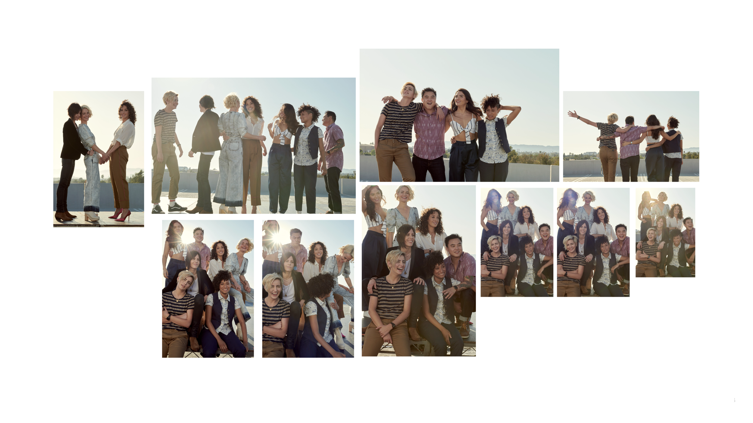
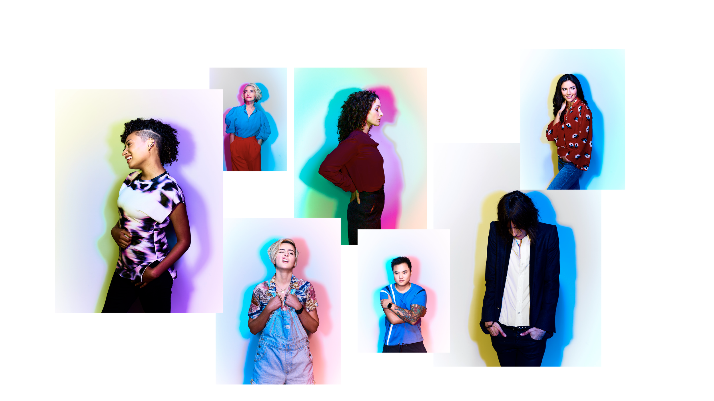
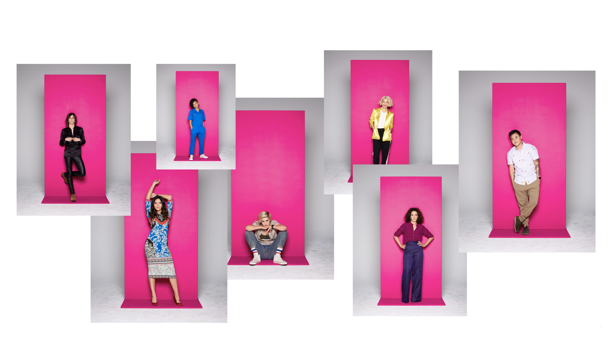
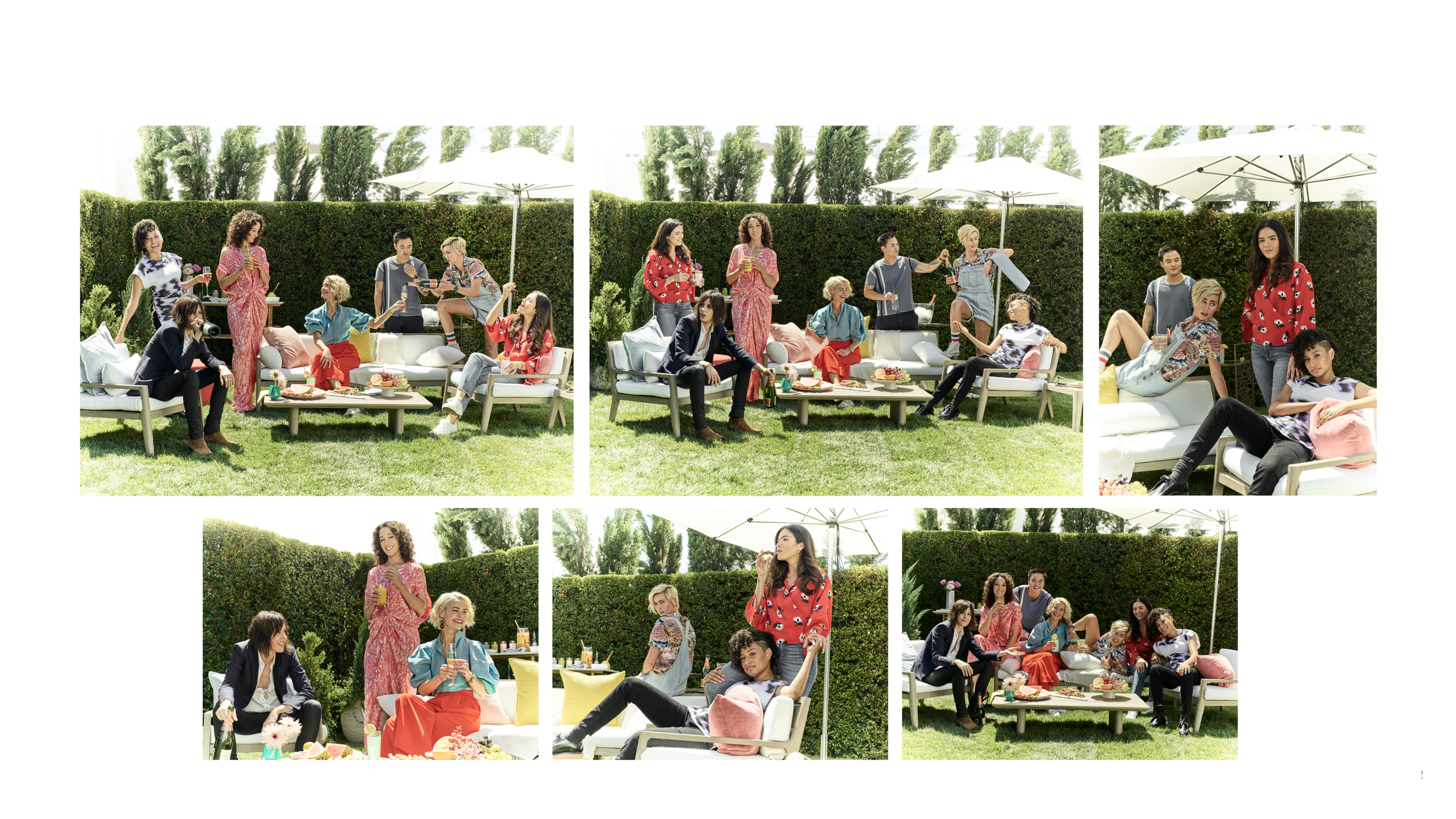
I led the campaign's creative development from concept through final execution, partnering with photographer Cass Bird to create a visual identity rooted in authenticity, intimacy, and community. The approach embraced a naturalistic aesthetic, intentionally moving away from the bold color language associated with the original series.
For Season One, we developed a cool, sun-washed palette that formed a subtle, deconstructed rainbow—a quiet nod to queer identity without relying on explicit iconography. The resulting imagery felt observational and emotionally grounded, reflecting the lived experiences and relationships at the heart of the series while positioning the franchise for a new generation.
campaign


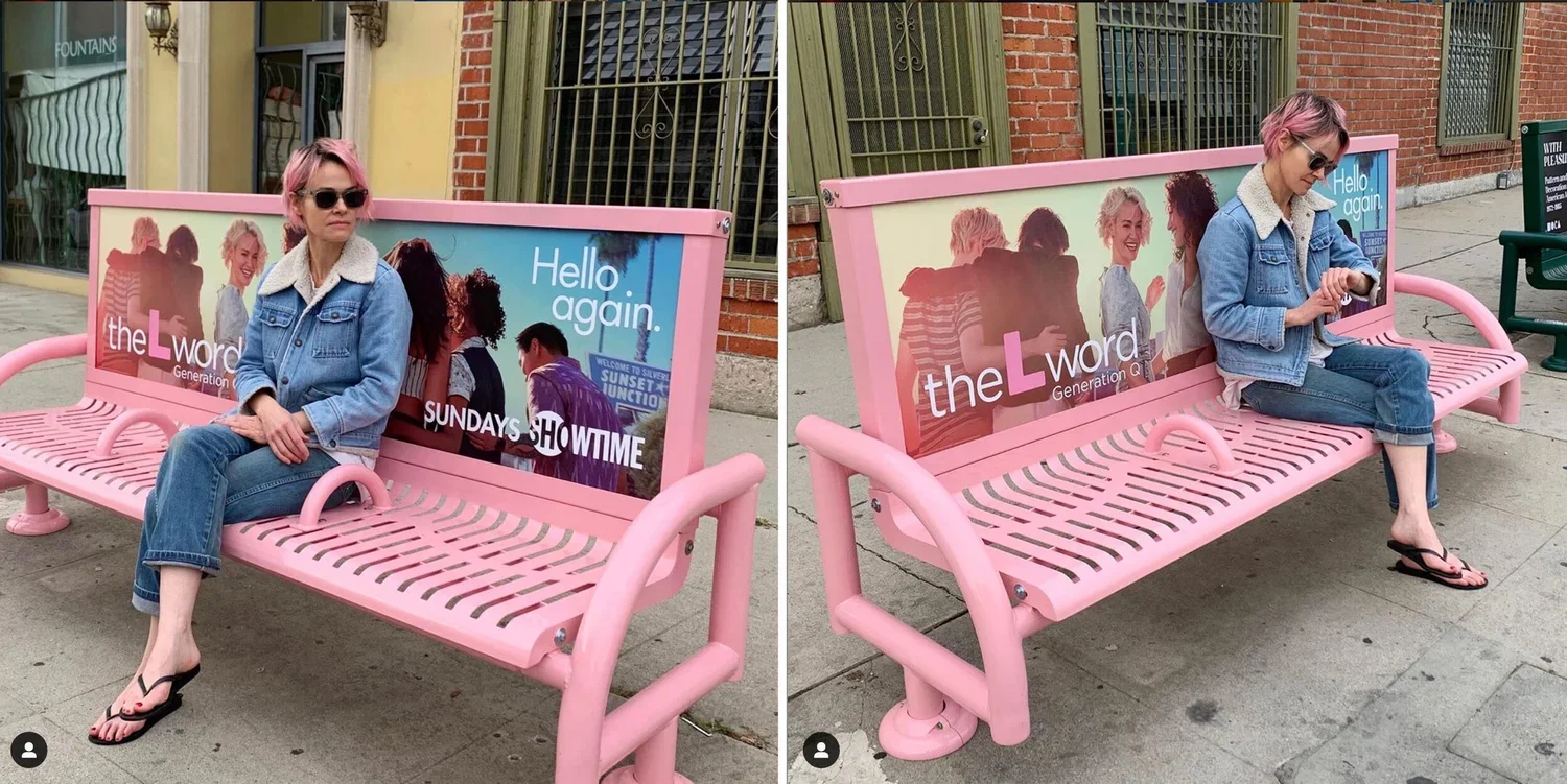
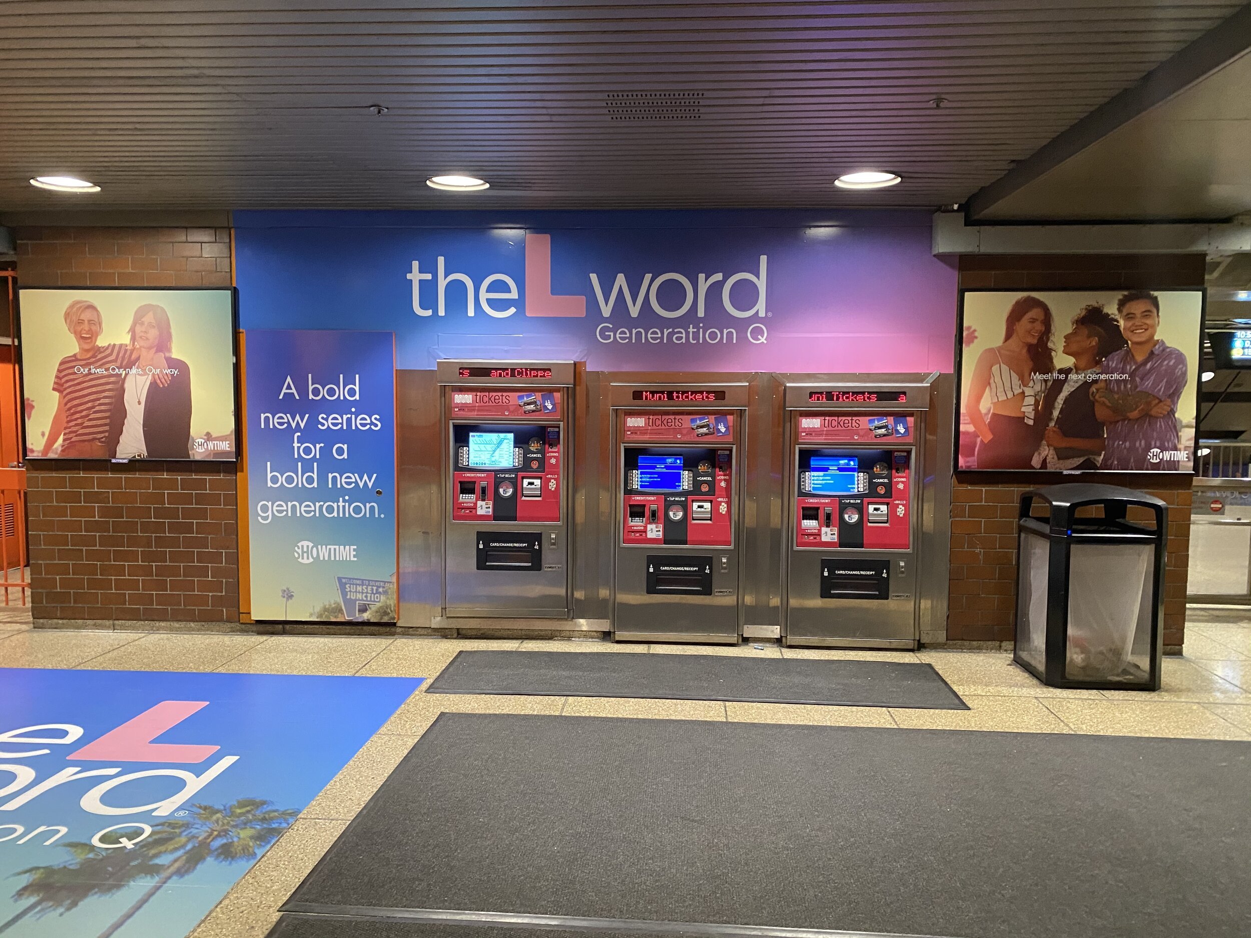
out-of-home

photography
credits
Advertising Photographer: Cass Bird
PR Photohrapher: Kharen Hill
Creative Director: Bob Motzenbecker
Art Director: Rebecca Wheatman
Copywriters: Jordan Scott, Michael Nassar