creative for story-led brands
ROLE
Lead Art Director
CLIENT
Showtime
SCOPE
Launch Campaign
CHANNELS
Key Art • OOH • Digital • Social • Print
TEAM
Creative Directors: Bob Motzenbecker,
David Krtikashyan
Photographer: Brendan Meadows
Copywriter: Jordan Scott
PARTNERS
Percival + Associates (Key Art)
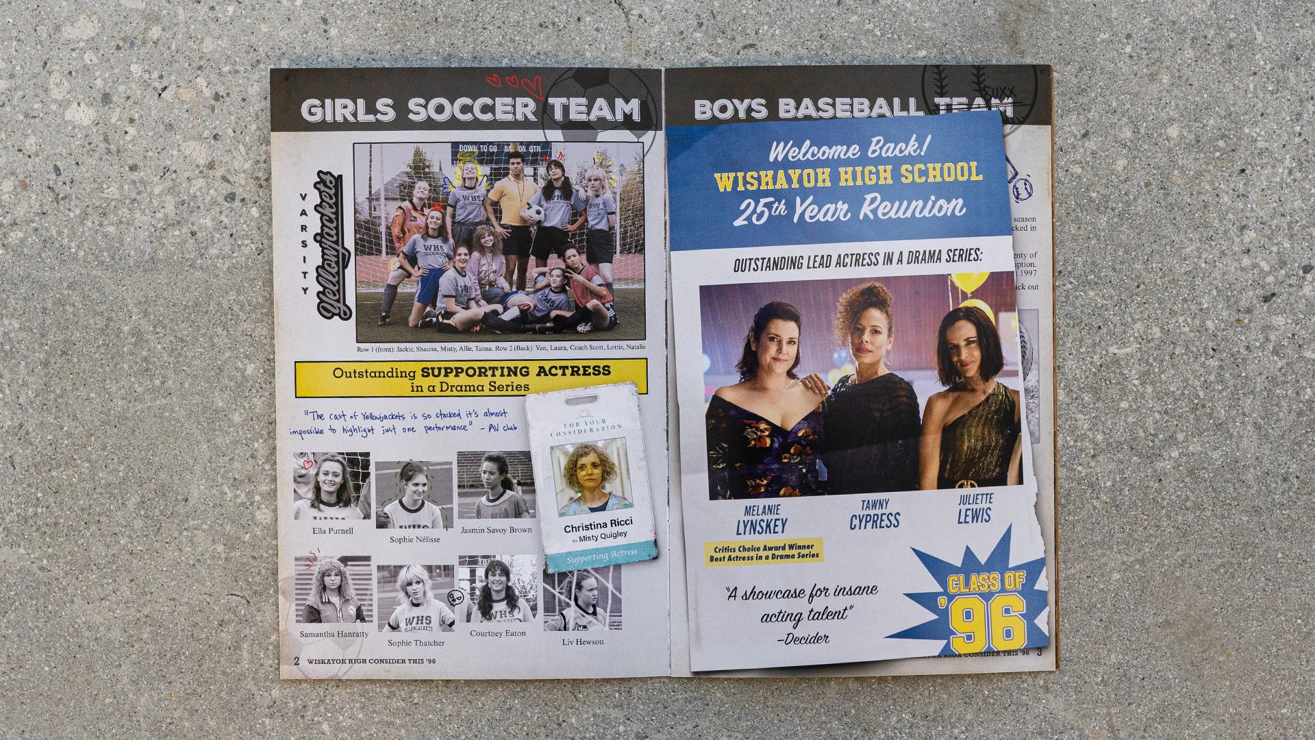
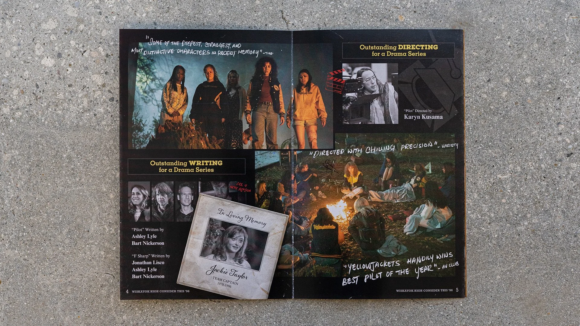
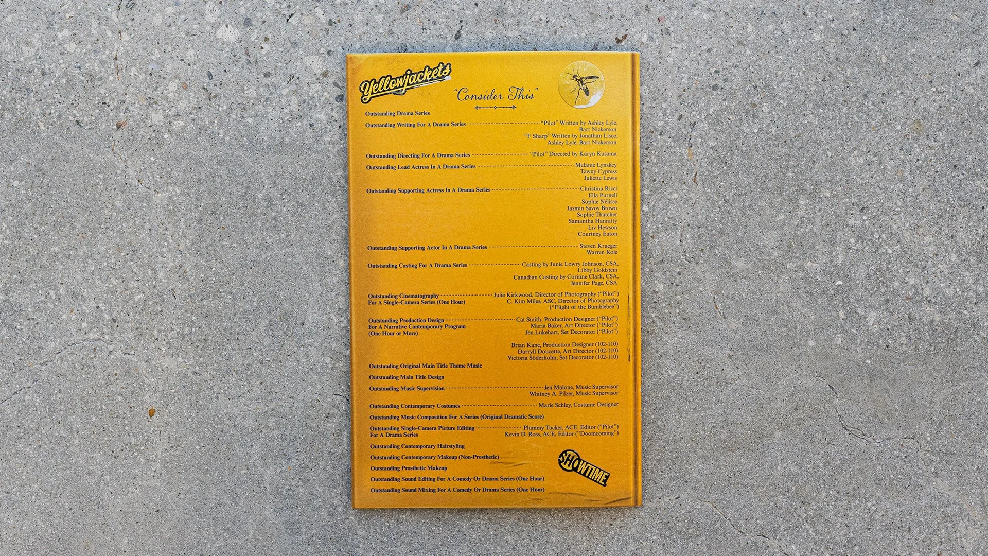
Legion Creative (FYC Yearbook)
Arsonal (Living Key Art)
RESULTS
IndieWire — 25 Best Film and Television Posters of 2021
Promax Gold — Overall Key Art Poster (2022)
Promax Silver — Key Art Poster: Dramatic Program (2022)
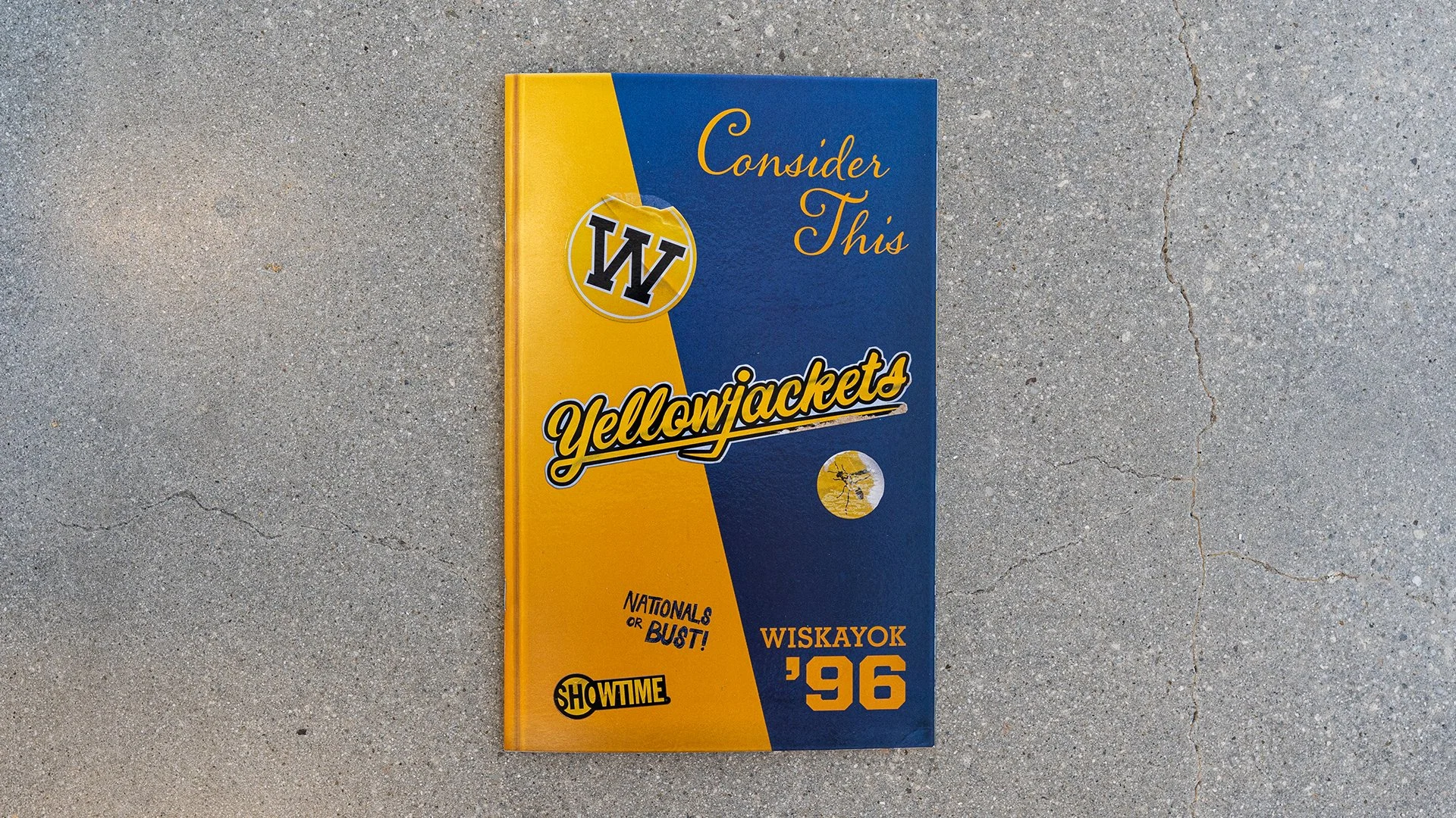
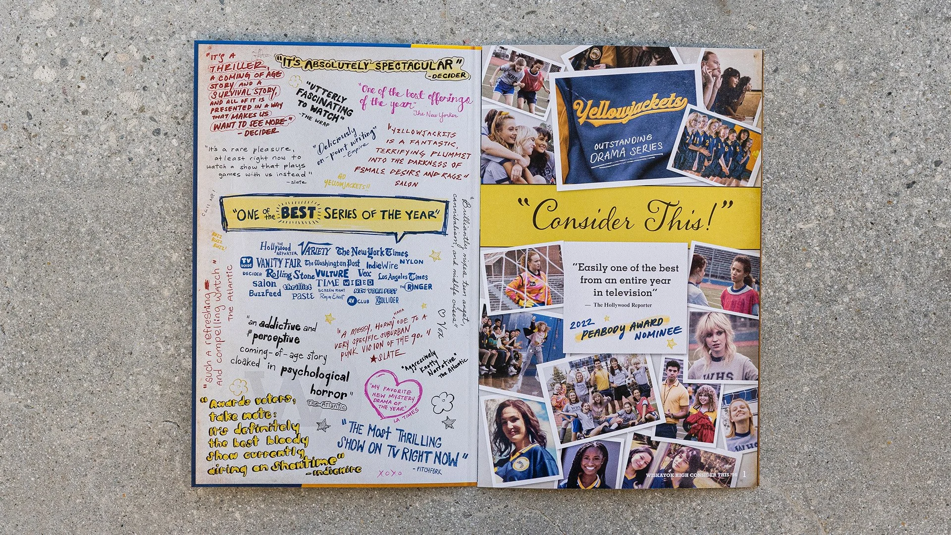
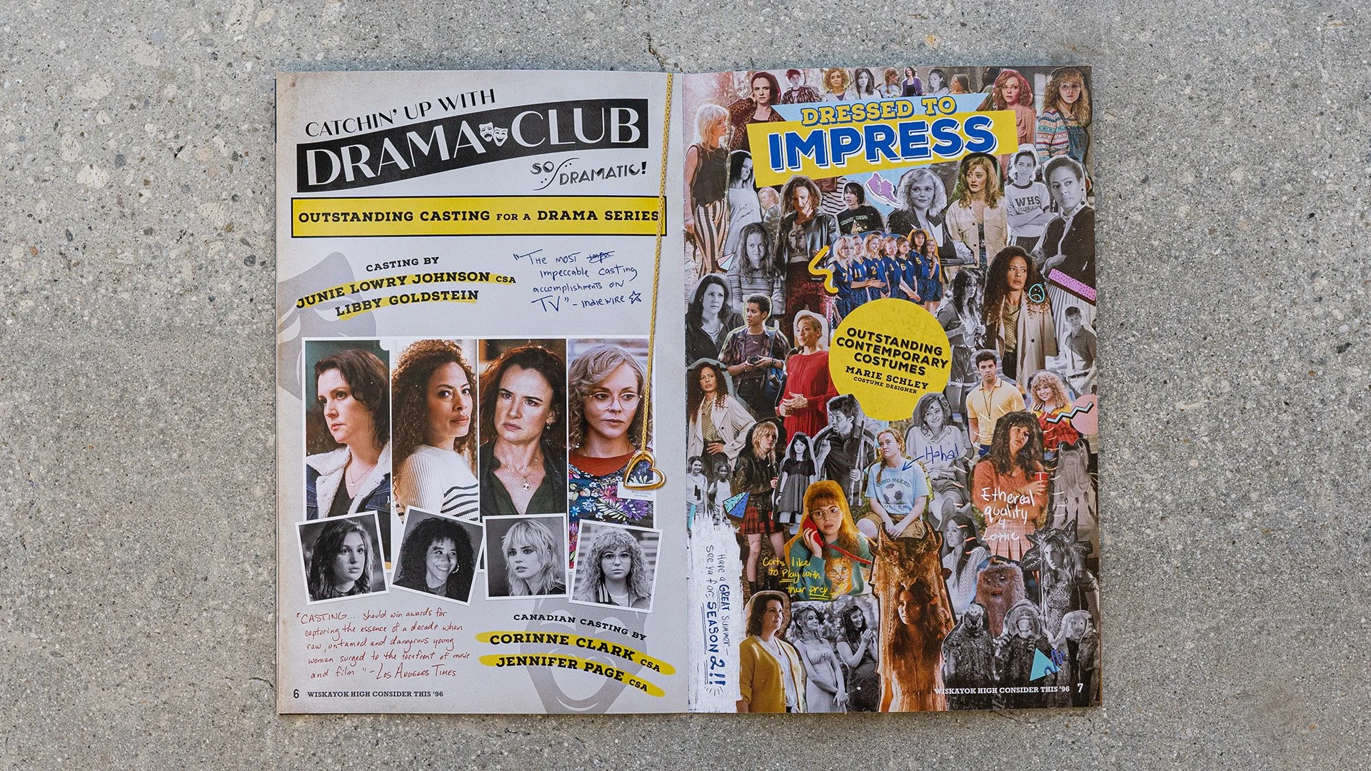
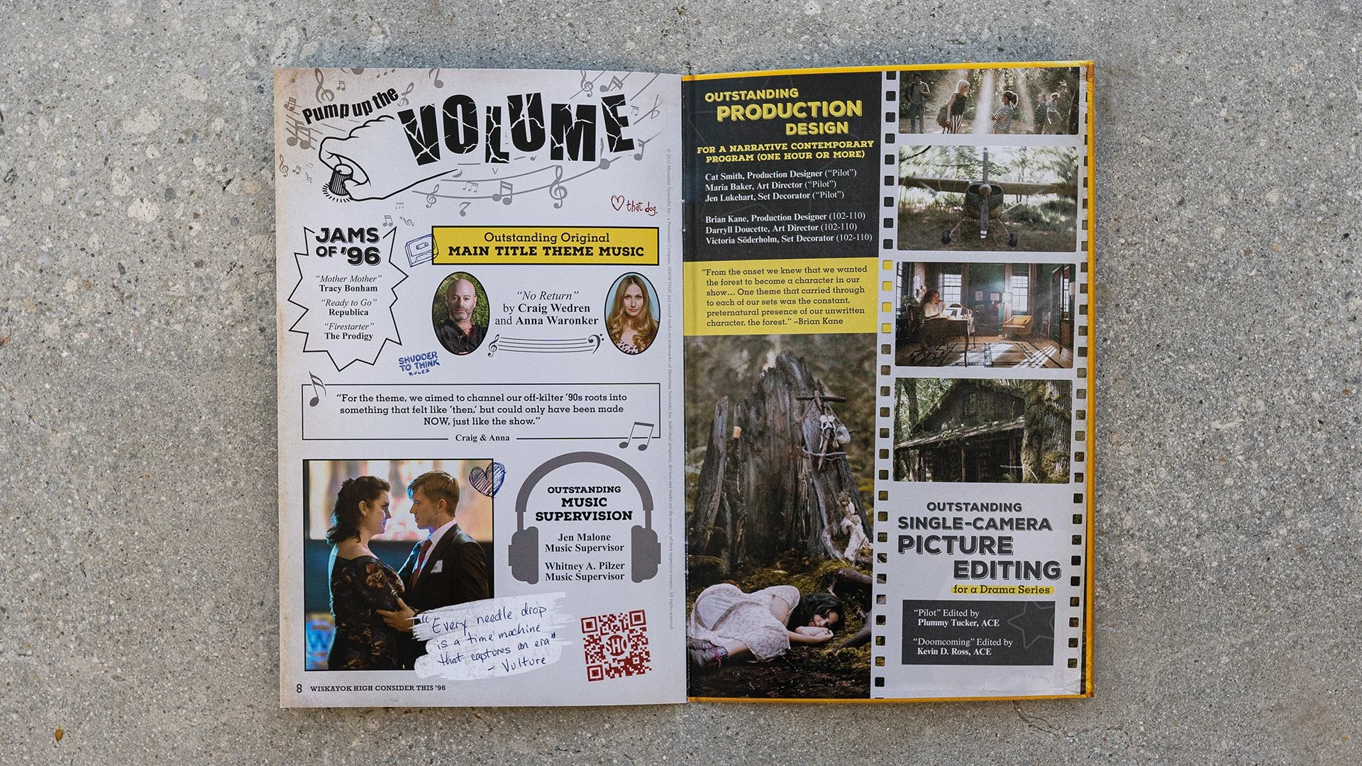
Promax Gold — Print Premium or Specialty Item: FYC Yearbook (2023)
CLIO Entertainment Silver — Television/Series Domestic One-Sheet (2022)
CLIO Entertainment Bronze — Television/Series Integrated Campaign (2022)
5M+ Weekly Cross-Platform Audience
Integrated launch across print, digital, social, OOH & FYC
brief
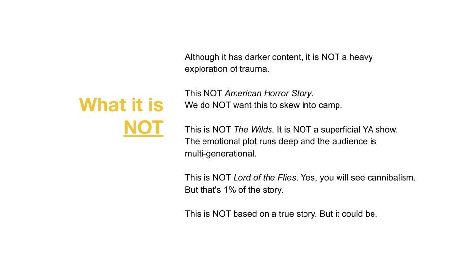
Yellowjackets didn't fit neatly into a single genre, and that was both its greatest strength and its biggest creative challenge. The campaign needed to attract prestige television audiences without alienating horror fans, capturing the show's psychological tension and survival themes without relying on familiar clichés. Our mission was to launch a completely unknown series while preserving the mystery surrounding it.
mystery, dual timelines, and an unforgettable visual identity that helped introduce one of Showtime's biggest originals.
solution
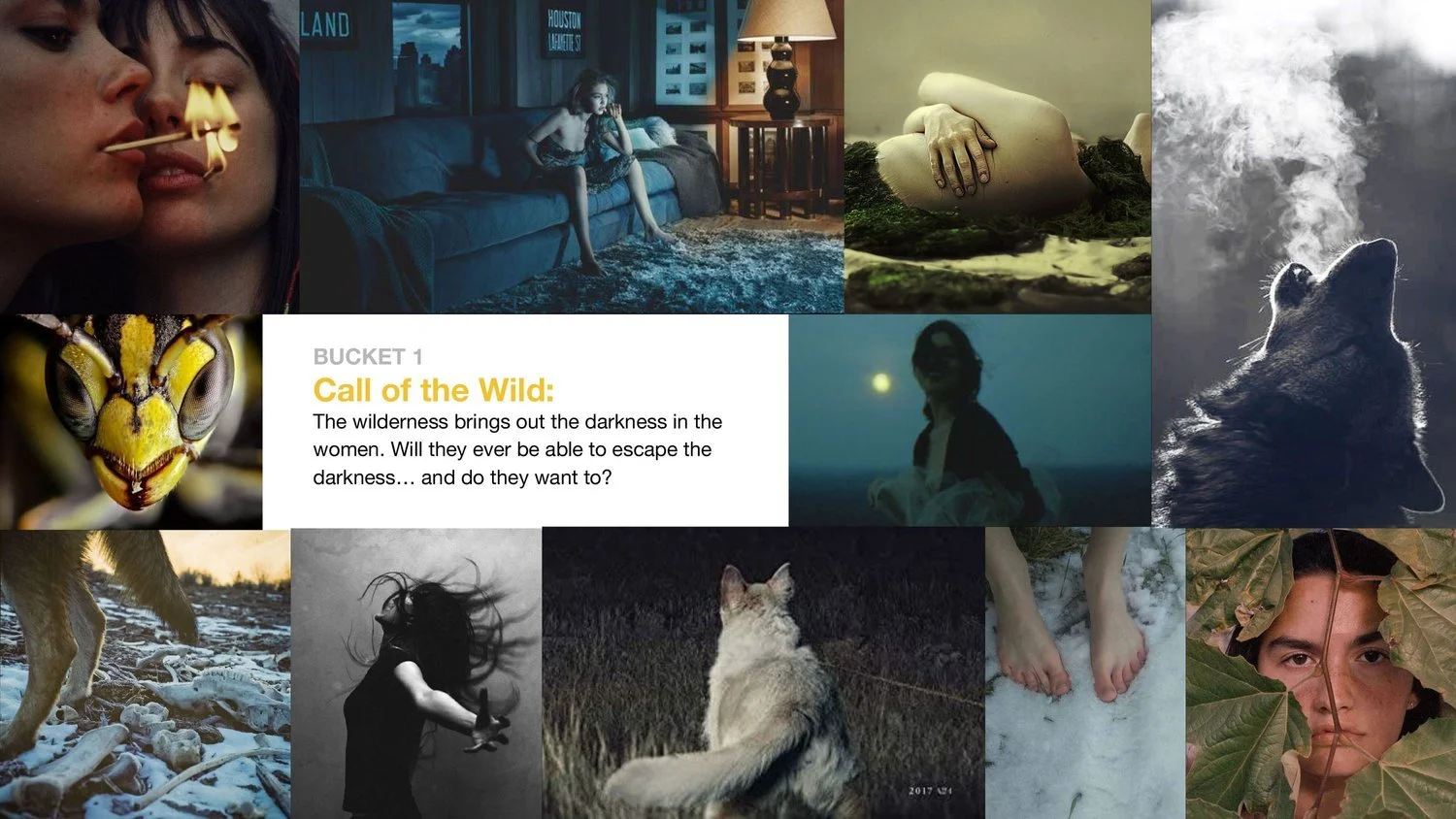
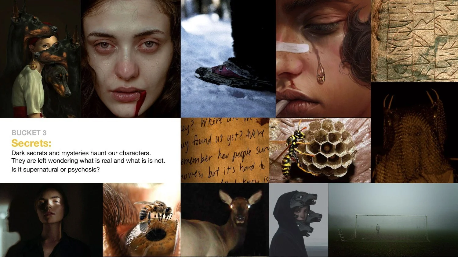
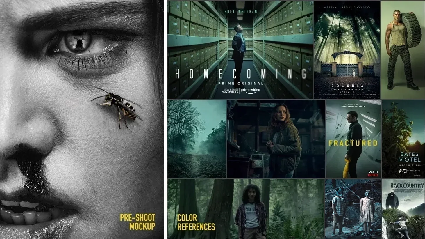
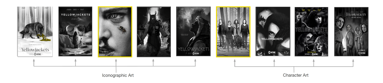
I led concept development and art direction from initial exploration through campaign rollout. Inspired by Memento Mori and the psychological cost of survival, the concept explored beauty and brutality, innocence and ferality, asking: Does the darkness live in the wilderness or in the women?
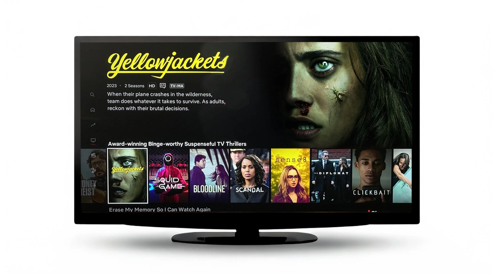
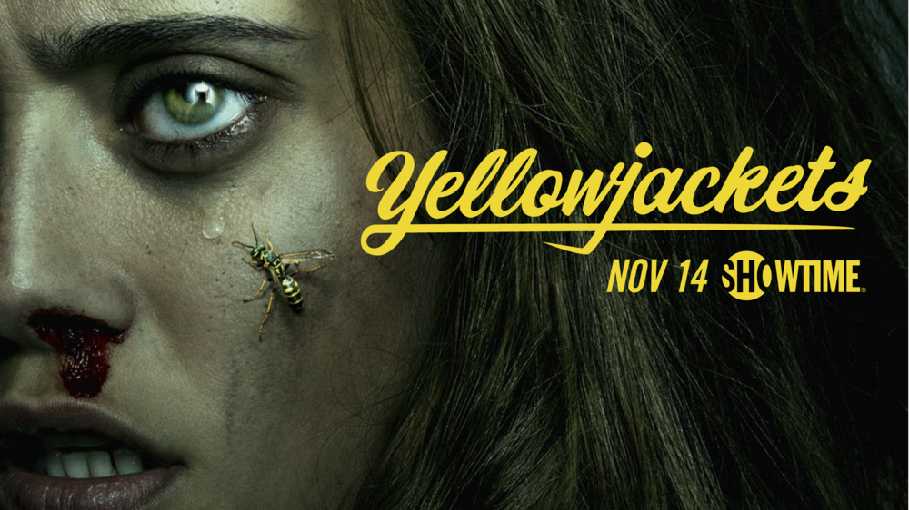
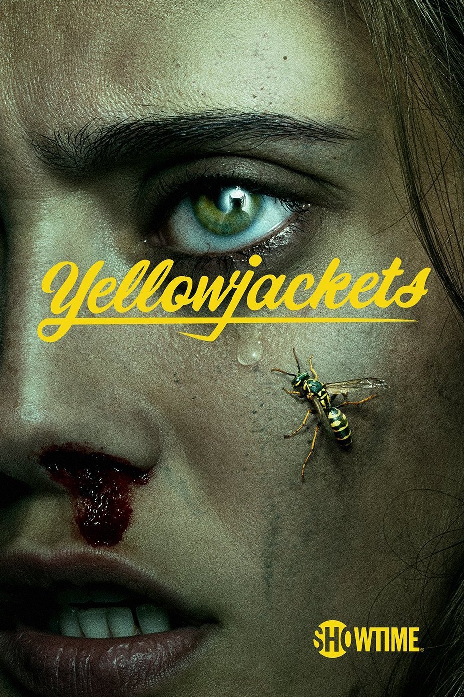
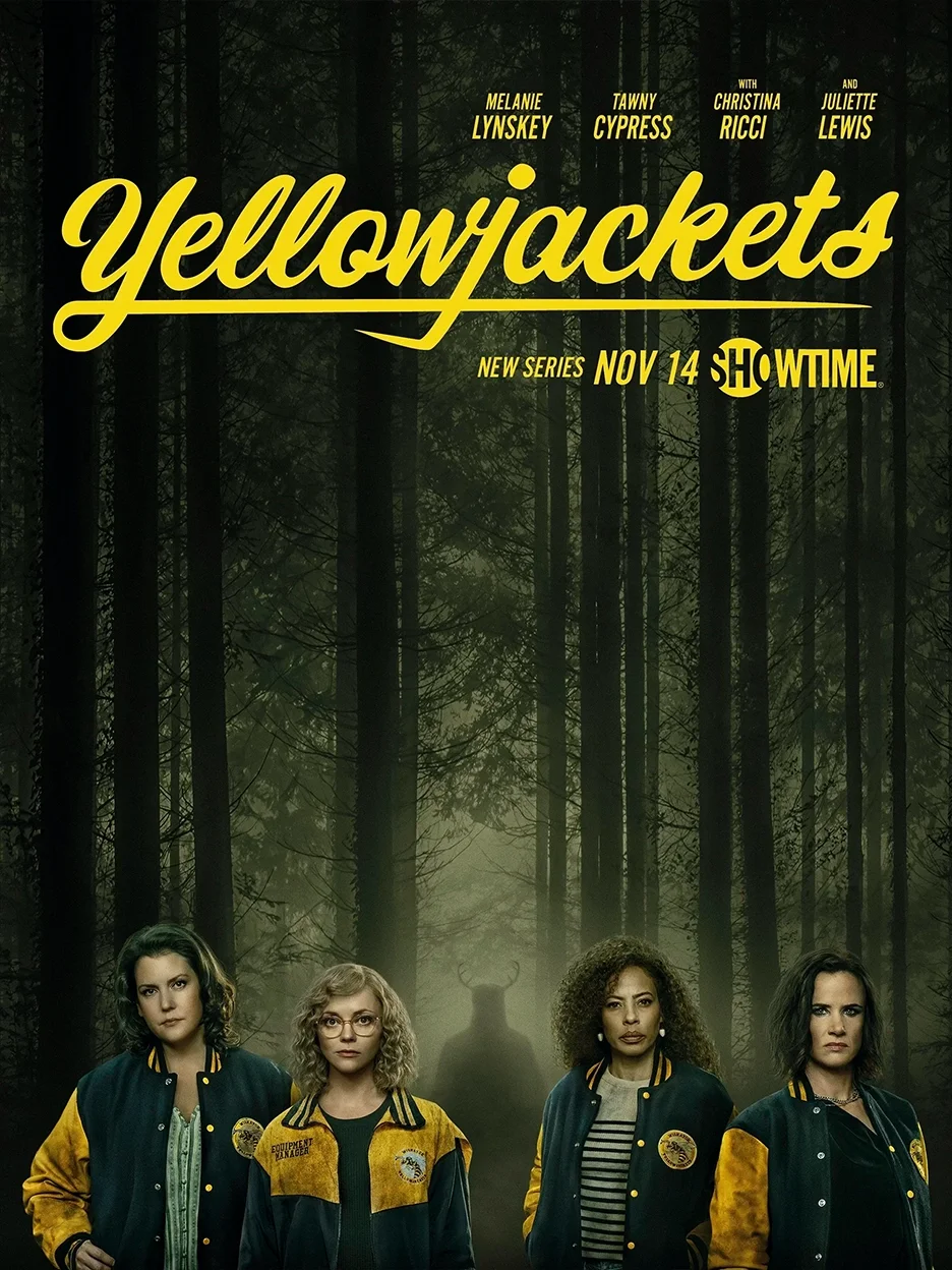
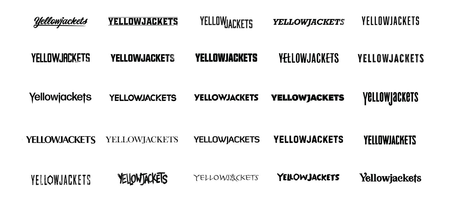
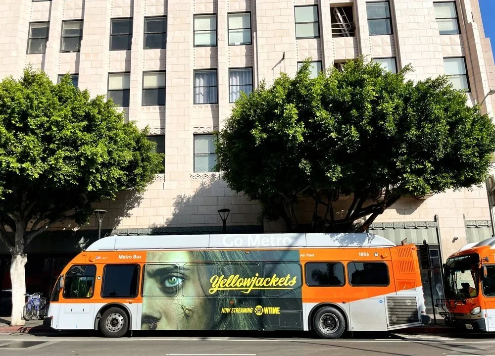
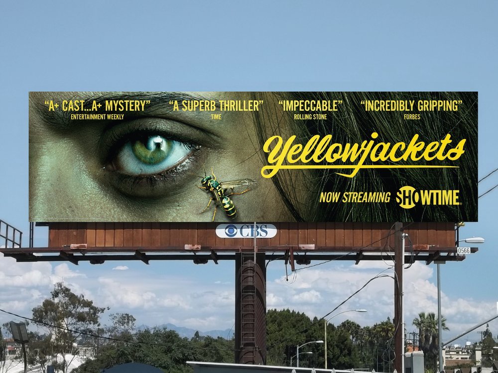
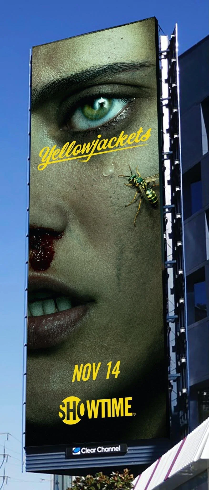
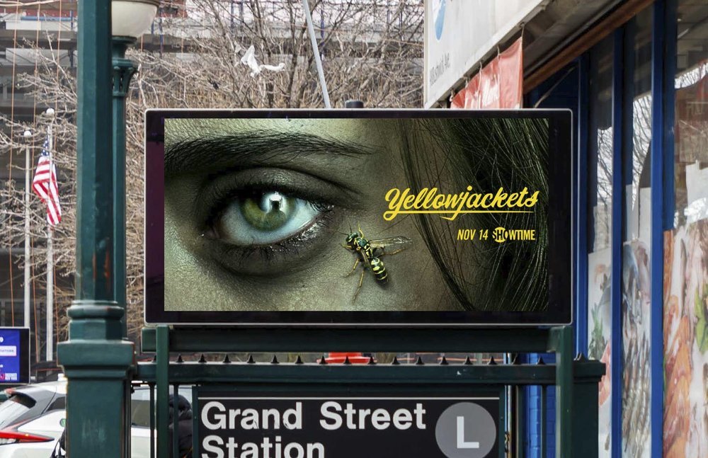
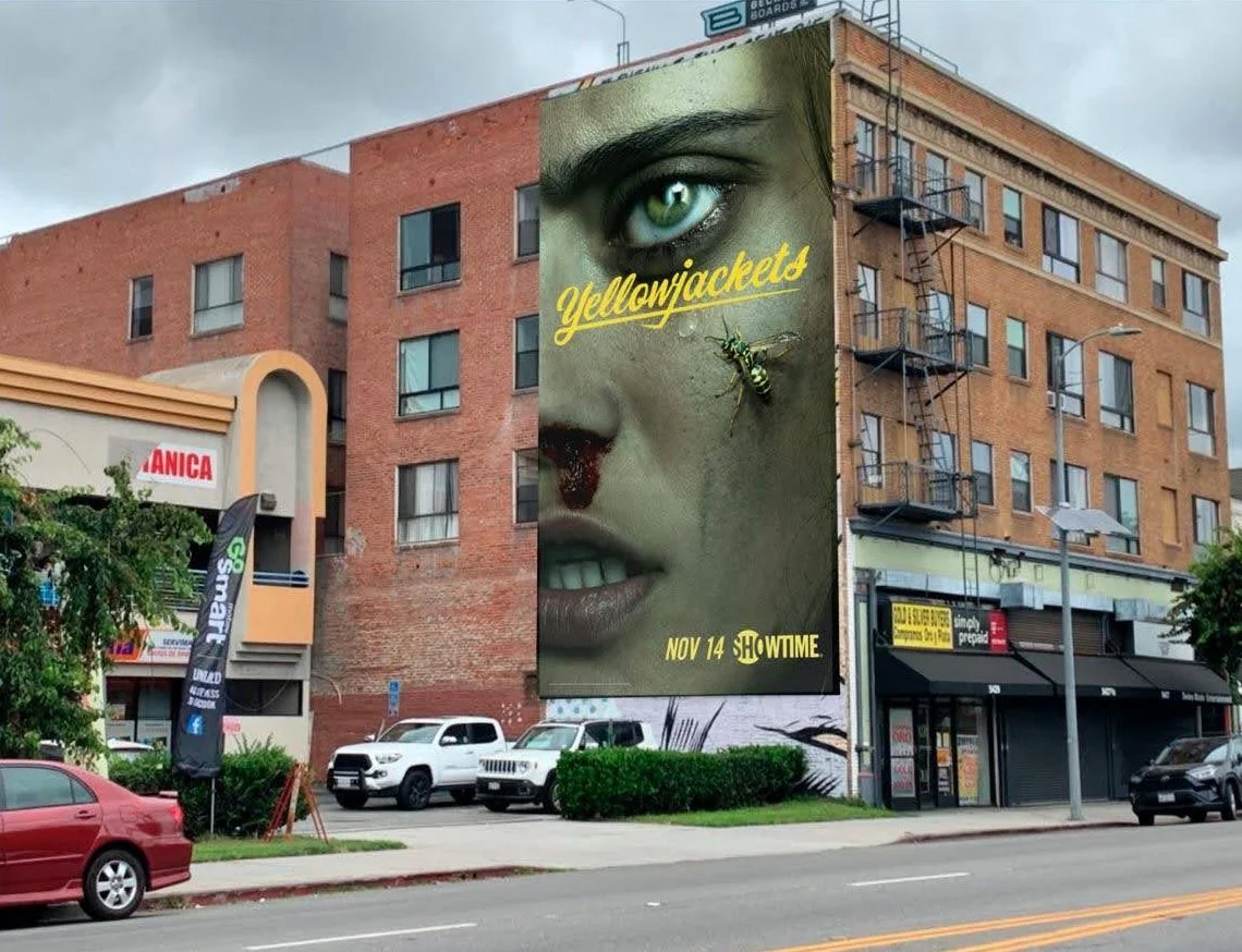
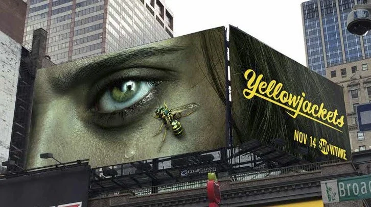
I developed pre-shoot mockups and presented the direction to network executives and the show’s creators, then supported shoot planning through shot lists, wardrobe input, and photographer selection. Percival handled the final key art design execution based on my pre-shoot mockups and commissioned sketches. For the teaser, I pushed for a tight crop on Jackie’s face to keep her identity ambiguous and create an unsettling intimacy. The figure reflected in her eye hints at the danger ahead without revealing the show’s twists. The yellow logotype references the team’s colors and soccer roots. We later expanded the campaign to feature more of the ensemble.
concept development


out-of-home
fyc mailer
digital & social